
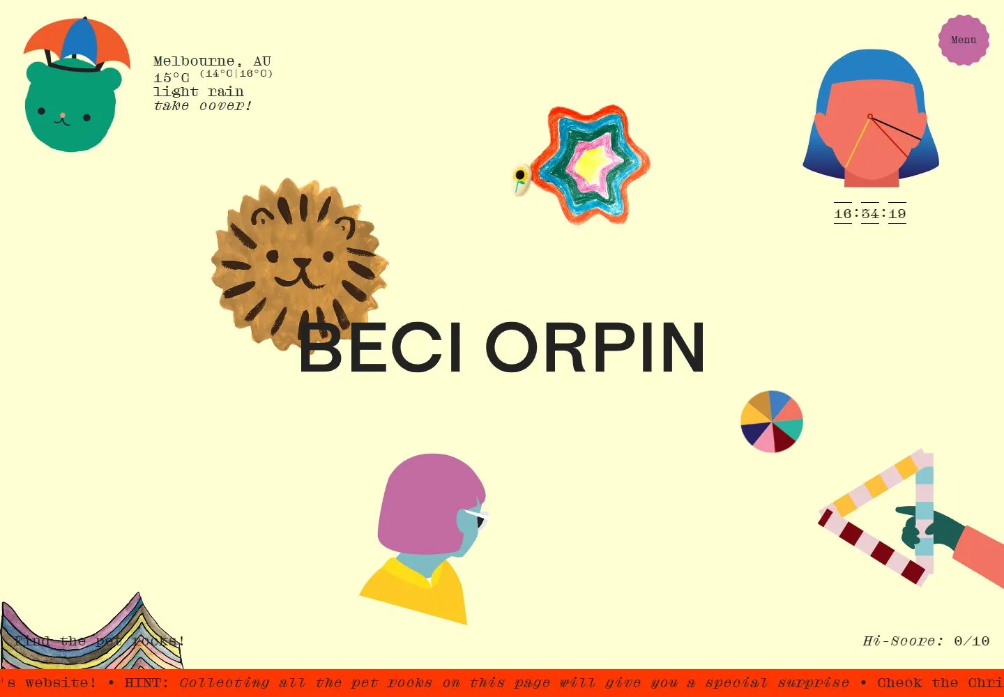
Live capture at 1440px, 2026-10-24
How it’s built
- Layout
- Pale yellow field scatters colorful flat and textured character illustrations around a large centered black uppercase name; small typewriter-like information and red bottom strip frame the view.
- Type
- Large black uppercase sans name; small monospaced-looking and italic information.
- Color and surface
- Pale yellow, black, red and colorful blue, pink, green and ochre illustrations.
- Components
- Scattered playful illustrations, central name, small corner information and red bottom strip.
What makes it work
- Pale yellow field
- scattered colorful mixed-texture illustrations
- central black uppercase name
- small typewriter-like labels
- red bottom strip
On a new subjectFor a children’s public library, scatter colorful mixed-texture book and animal illustrations around a centered black uppercase identity on pale yellow with small typewriter-like labels and red bottom strip.
Measured
Fonts loadeddroulers
Body text20px
Page background#ffffd3
Text color#222222
Page height1,000px
Computed CSS at 1440px, 2026-10-24.
Live behavior
- Today
- Beci Orpin’s capture is a playful, single-screen illustrated page on a pale buttery-yellow ground. A large black BECI ORPIN wordmark crosses the middle, partly overlapped by a hand-drawn lion. A weather character and Melbourne conditions sit at upper left; a scalloped pink Menu badge and illustrated clock occupy the upper right. Other colorful cutout-like figures and shapes are scattered around the wordmark. Near the bottom, “Find the pet rocks!” and a Hi-Score 0/10 label sit over a narrow red-orange scrolling message strip.
- Responsive
- At 1440×1000 the illustrations float across one open page with the wordmark centered and the score at the lower right. At 768×1024 and 390×844 the elements scale and reposition into a taller composition; the phone places weather at the top, the title and pet-rock illustrations down the center, then the score and ticker at the bottom. All six measurements report document dimensions equal to their viewport and actual scrollY=0, including the state labeled desktop-scroll. These frames do not establish a scroll layout or breakpoint rules.
- Scroll
- The desktop state named desktop-scroll is measured at 1440×1000 with document height 1000 and actual scrollY=0. It shows the same one-screen arrangement with small illustration/clock changes, not a verified scrolled view. No page control or pet-rock interaction was tested.


