
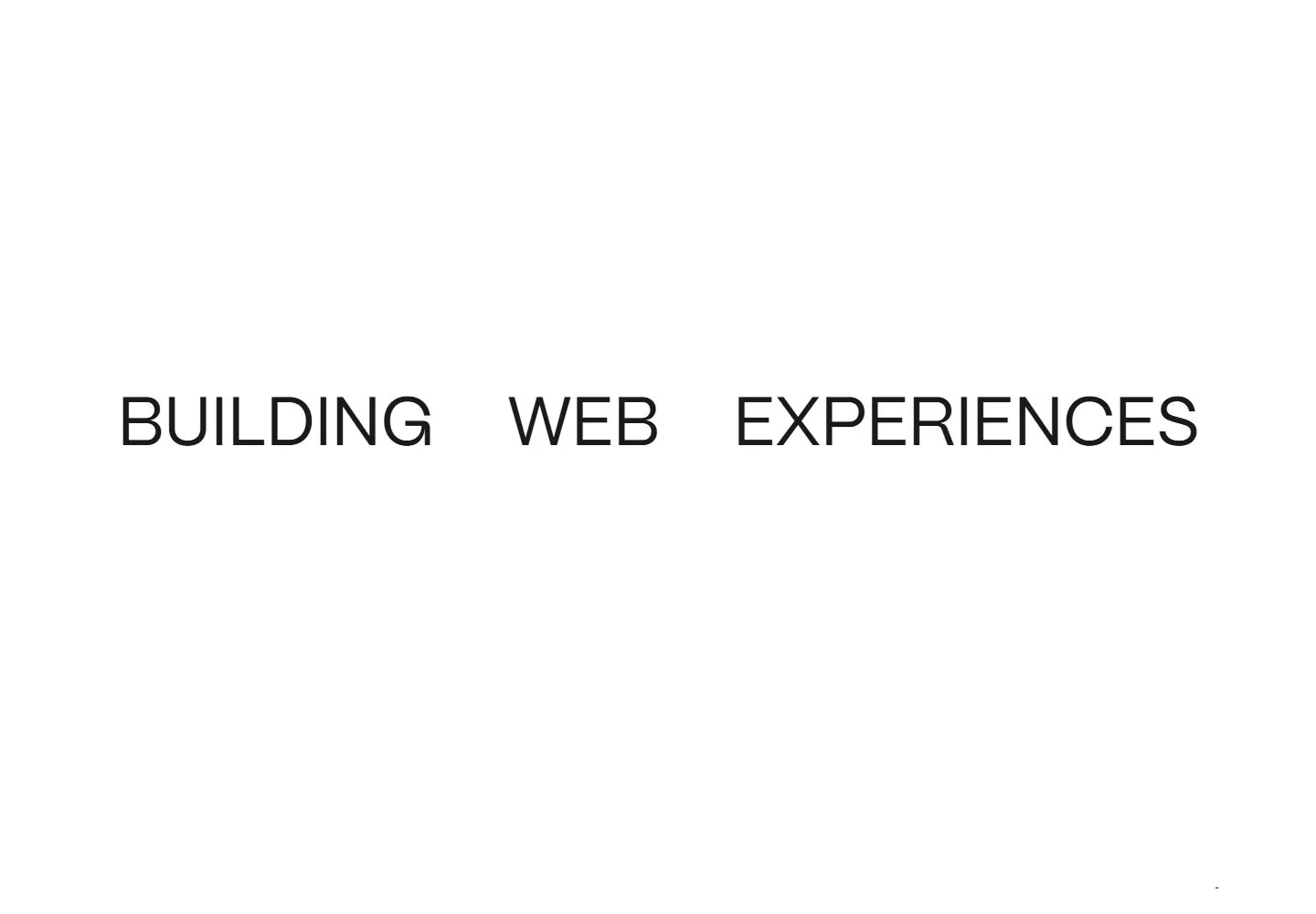
Live capture at 1440px, 2026-10-24
How it’s built
- Layout
- White page with compact logo/nav rail at the very top and a very large, widely spaced three-part headline “BUILDING WEB EXPERIENCES” across the upper third; “FOR DESIGN-FIRST BRANDS” sits below the final word. A horizontal divider separates it from “THINGS WE DID” and contact details. The lower portion begins a two-column project grid with titles, images, small rotated year labels and captions; the left image is a black-and-white skeleton illustration and the right is a large group portrait. More content continues below the crop.
- Type
- Large thin uppercase sans headline with generous tracking; medium sans project titles and body; small uppercase utilities. Exact font/metrics unavailable.
- Color and surface
- White field, black type and fine gray divider, with high-contrast project imagery and tiny blue arrow accent. Broad whitespace separates headline from work.
- Components
- Top logo/navigation/contact, oversized headline/tagline, divider, section label, two project tiles with metadata/year labels.
What makes it work
- White open field
- Oversized wide-spaced proposition
- Clear separation before projects
- Large project imagery with concise labels
On a new subjectLead an unrelated portfolio with a spacious typographic statement, then separate a small set of labeled work examples with a clear rule or gap. Replace brand, project images and claims.
Measured
Fonts loadedPpmori, Karla
H175.1722px / 400 / -0.9px
Body text16px
Page background#ffffff
Text color#000000
Page height11,724px
Computed CSS at 1440px, 2026-10-24.
Live behavior
- Today
- A sparse white portfolio uses a slim top navigation with small multicolor identity, distributed links and underlined contact arrow. Three large regular uppercase black words spread across the hero, with smaller right-aligned subline, extensive white space and bottom corner labels. A fine rule introduces uneven project columns with titles, images, vertical year labels and small metadata.
- Responsive
- At tablet width the desktop links collapse to a MENU control, the headline stays on one line at reduced scale and the first visible project sits on the right. On phone the headline wraps to two left-aligned lines, contact links spread across the bottom of a shorter hero, and the first project fills most of the width. Only these widths are observed.
- Scroll
- Actual desktop scroll 750 reveals a staggered two-column project grid with image-led cards, year marks, metadata and view arrows. Navigation remains near the top in this pair; the exact positioning mechanism is not inferred.


