
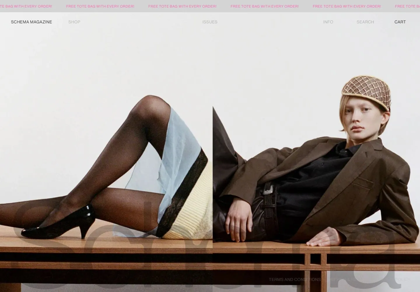
Live capture at 1440px, 2026-10-25
How it’s built
- Layout
- A white editorial spread combines two photographic-looking image panels with tiny centered metadata and enormous pale multitone translucent-looking lettering across the bottom. The word begins with a capital followed by lowercase forms, with high-contrast serif-like terminals; the visual mechanism is unknown.
- Type
- Enormous pale multitone translucent-looking word with initial capital and lowercase remainder, featuring high-contrast serif-like terminals; very small metadata. Exact font and overlay mechanism unknown.
- Color and surface
- White and gray, muted image panels and pale multitone translucent-looking lettering.
- Components
- Two image panels are overlaid by enormous pale multitone translucent-looking lettering with an initial capital, lowercase remainder and high-contrast serif-like terminals across the bottom.
What makes it work
- White editorial field
- Two photographic-looking image panels
- Enormous pale multitone translucent-looking lettering with initial capital, lowercase remainder and high-contrast serif-like terminals across bottom
- Tiny metadata
On a new subjectFor a public textile archive, pair two original fabric-image panels with enormous pale multitone translucent-looking lettering with an initial capital, lowercase remainder and high-contrast serif-like terminals across the bottom, plus tiny metadata on white.
Measured
Fonts loadedNeue Haas Grotesk Display Pro
H156px / 400
Body text14px
Page background#ffffff
Text color#000000
Page height1,000px
Computed CSS at 1440px, 2026-10-25.
Live behavior
- Today
- The 1440x1000 first viewport is dominated by a tightly cropped fashion photograph of two seated models, with a repeating pink promotional strip at top, a light navigation row, and faint legal links over the image near the bottom. The photographed desktop crops and positions the same hero across timed and hover frames. At 768px the image remains a wide crop with simplified navigation; phone switches to a single model image with compact menu/brand/cart controls and a large translucent wordmark behind the figure.
- Responsive
- Desktop 1440x1000 and tablet 768x1024 show a two-person hero photograph; 390x844 changes to a single standing model and compact three-part header. Desktop navigation separates Shop, Issues, Info, Search and Cart; narrow view exposes Menu, Schema Magazine and cart. These saved widths do not establish breakpoint thresholds or page behavior after scrolling.
- Scroll
- The desktop-scroll capture records actual scrollY0 and document height1000, and its image remains the hero. It therefore supplies no evidence about lower sections, sticky behavior, or a scroll transition.


