
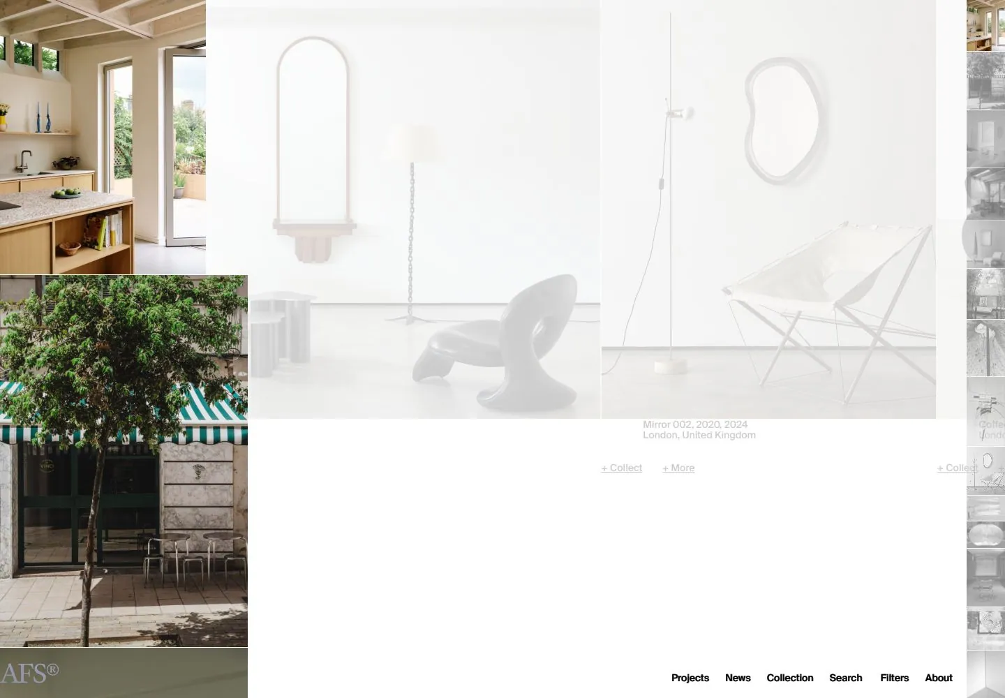
Live capture at 1440px, 2026-10-25
How it’s built
- Layout
- A white page displays a horizontal row of interior photographs with tiny product metadata and underlined links below; compact bottom navigation.
- Type
- Tiny black sans product labels and links.
- Color and surface
- White field and muted interior photography.
- Components
- Horizontal interior-image panels sit above tiny product metadata and underlined links on white.
What makes it work
- White field
- Horizontal photographic-looking image panels
- Tiny metadata and underlined links
- Compact navigation
On a new subjectFor a public architecture archive, place horizontal building-image panels above tiny metadata and underlined links on white with compact navigation.
Prompts
Create a visual archive for {{website_name}} in {{industry}} serving {{audience}}, presenting {{content}} and useful {{functionality}}. Invariants: Preserve the captured composition: a wide image-led field broken into overlapping horizontal bands of varied interior/object photographs, small labels close to each image, a narrow secondary image strip at the far right, and compact navigation near the lower edge. Visual estimate: the main image field uses nearly 100% of viewport width and most of the upper viewport; side thumbnails remain narrow. Photography carries the subject and color; captions and collection labels stay small. In this admitted live capture, much of the central region is unusually washed out and pale, with darker interior/storefront photos at left. Treat that as a capture caveat, not the essential palette; keep new imagery and labels clearly visible. Avoid a fixed card grid: image sizes vary and layers overlap. Variables: select original built-environment/object imagery, metadata, colors, filters, and links for {{website_name}}, {{industry}}, {{audience}}, {{content}}, and {{functionality}} while retaining photo-first hierarchy. Prohibitions: no source images, identity, captions, exact ordering, or imitation of washout. Do not claim image transitions, filters, collection actions, or hover; those were not tested. Responsive proposal: at small widths use a clear image sequence with captions attached, keep taxonomy accessible, and avoid overlap that hides essential information.
Implement a responsive image archive for {{website_name}} in {{industry}} for {{audience}}, organizing {{content}} and providing {{functionality}}. Invariants: Preserve the underlying structure: varied interior/object photographs dominate a broad canvas; overlapping or banded image groups replace uniform cards; concise captions/metadata stay secondary; a narrow thumbnail rail and bottom navigation are optional. Screenshot estimate places the primary image field near nearly 100% of viewport width. The measured matching live DOM is a tall archive with compact bottom nav; see research/evidence/div2-0018/measurements-desktop.json. The capture looks washed out and low contrast, so don't encode that into the new CSS; choose a subject-appropriate palette with clear image and caption contrast. Variables: use new imagery, taxonomy, labels, and controls for {{website_name}}, {{industry}}, {{audience}}, {{content}}, and {{functionality}}. Keep image sizes irregular and contextual, while preserving content order and captions. Prohibitions: Do not copy source photos, project names, positions, or text. Scrolling, filtering, collecting, and transitions were not tested; new behavior may be implemented for {{functionality}}, but don't call it observed reference behavior. Responsive proposal: reduce overlap, move to one/two columns, keep image-caption pairs and accessible filters. Provide semantic links, keyboard-operable controls, meaningful alt text, visible focus, and readable contrast. Keep source images at varied scales and use clean overlaps; captions should locate items without obscuring material details, and image legibility takes priority if new photographs are pale.
Measured
Fonts loadedSuisse Intl
H114px / 400
Body text14px
Page backgroundtransparent
Text color#000000
Page height38,499px
Computed CSS at 1440px, 2026-10-25.
Live behavior
- Today
- An image-led archive uses large architectural photographs against a white field, with a narrow vertical thumbnail strip at the desktop right edge and compact navigation along the bottom. A centered white newsletter dialog covers part of the image and a pale overlay mutes the underlying desktop content.
- Responsive
- Tablet and phone show a large cropped interior photograph, a compact centered signup dialog, and bottom Menu and Filters labels. The separately initialized fresh phone frame instead shows an image above a simple vertical navigation list without the dialog. Visible dialog and navigation text declare Suisse Intl at 14px.
- Scroll
- At actual desktop scrollY 750 the left-hand image strip changes while the centered dialog and muted underlying archive remain visible. One screenshot does not establish complete scrolling behavior.


