
Live capture at 1440px, 2026-10-24
How it’s built
- Layout
- A light gray bounded page uses huge narrow red uppercase words staggered across the left and over a rectangular blue photographic-looking image on the right. The letterforms look monospaced, with rounded ends and slab-like I terminals. Small red identity and controls sit along the top.
- Type
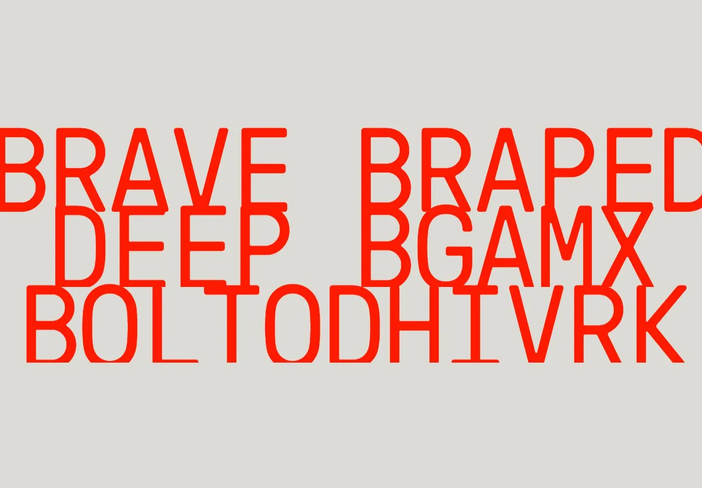
- Huge narrow monospaced-looking uppercase red letters, with rounded ends and slab-like I terminals, in tightly stacked lines; small compact header. Exact font unknown.
- Color and surface
- Light gray, vivid red and dark blue photographic-looking image.
- Components
- Oversized narrow monospaced-looking red uppercase words, with rounded ends and slab-like I terminals, cross a light field and overlap a right-aligned blue image.
What makes it work
- Light gray field
- Oversized staggered red narrow monospaced-looking uppercase lettering with rounded ends and slab-like I terminals
- Right-aligned blue photographic-looking image
- Compact top controls
On a new subjectFor a public night-sky exhibit, stagger oversized red narrow monospaced-looking uppercase words with rounded ends and slab-like I terminals across a light gray field and a right-aligned blue night image, with compact top controls.
Measured
Fonts loadedGT Pressura, Monument Grotesk
H148px / 400 / -1.92px
Body text20px
Page background#dddbd6
Text color#ff1a00
Page height11,286px
Computed CSS at 1440px, 2026-10-24.
Live behavior
- Today
- The opening uses a warm light-gray field with a large centered red-orange brand consultancy line. A compact red monospace navigation list sits at upper left, a condensed VALIENTE mark at top center, and a vertical contact label and circle-arrow control at upper right. Small monospace phrases anchor the bottom edge. A full-width cinematic video section follows the opening field.
- Responsive
- The 1440px headline is 48px and centered; tablet uses 32px, and phone uses 28px over two lines. Tablet retains the left-side link list and right-side contact label. Phone replaces the broad desktop controls with a plus at the upper right; the headline and paired bottom labels remain visible. The reduced-motion phone frame instead shows three large red phrases stacked tightly in the center.
- Scroll
- At actual desktop scrollY 750, a dark blue full-width video image with a small silhouetted figure occupies most of the frame. A light-gray band below carries red monospace location and year labels at opposite ends; red menu lines and a circle-arrow control remain over the media.


