
Live capture at 1440px, 2026-10-24
How it’s built
- Layout
- Warm off-white page has a narrow left column with orange text and action, a large rounded product image right, and a vertical orange navigation rail at far right.
- Type
- Small orange rounded sans headline and tiny black supporting text.
- Color and surface
- Warm off-white, orange rail and action, natural product colors.
- Components
- Left text and action, large rounded image, vertical orange rail.
What makes it work
- Warm off-white
- narrow orange-text column
- large rounded image
- vertical orange rail
On a new subjectFor a public seed exchange, use a narrow orange-text column beside a rounded seed image and vertical orange rail on warm off-white.
Measured
Fonts loadedFutworaPro, Marcel, Cagliostro, Ginto, BlurBold
H150px / 400 / -0.3px
Body text10px
Page background#ffffff
Text color#432f29
Page height5,555px
Computed CSS at 1440px, 2026-10-24.
Live behavior
- Today
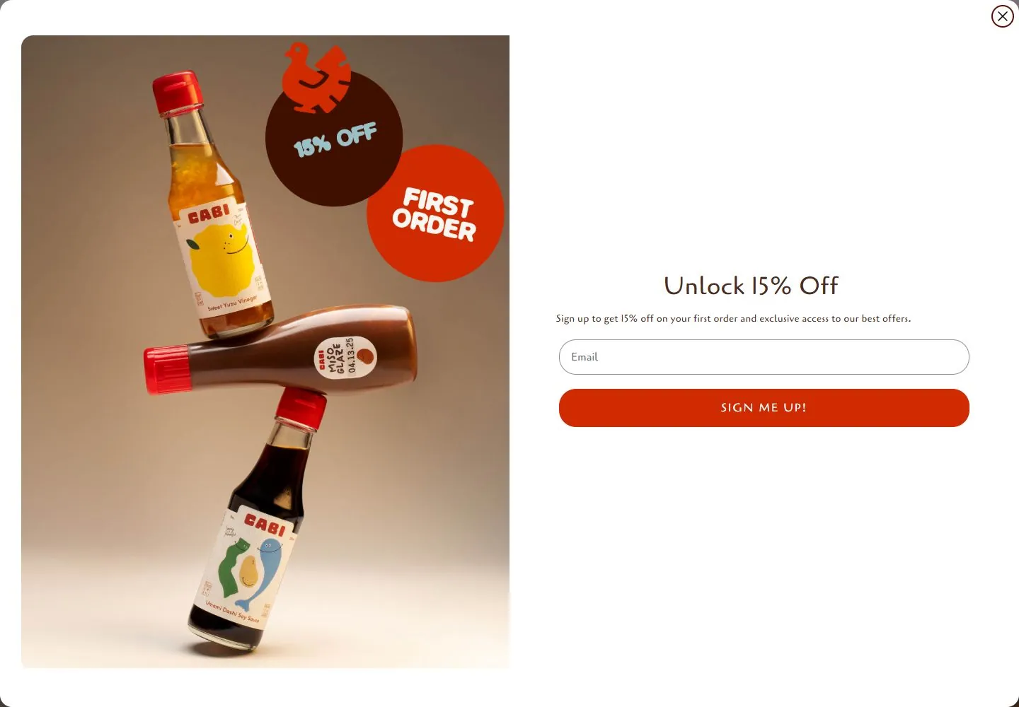
- Every saved Cabi Foods state shows a large white newsletter panel with a close control, a product photograph of two bottles on the left, and “Unlock 15% Off,” explanatory copy, an email field and red-orange signup button on the right. Tablet and phone widths crop or reflow this same panel; on phone the copy and form are partially outside the captured viewport. The selected gallery reference shows the underlying Cabi product home layout with a trio of bottles, side navigation and “Easy-to-use Japanese flavors” copy, which is not visible in the saved states.
- Responsive
- Desktop is 1440×1000 with a 5555px document; tablet is 768×1024 with a 7456px document; ordinary phone is 390×844 with a 6089px document; reduced-motion phone is 390×844 with a 5616px document. The tablet and phone screenshots show the newsletter panel rather than the underlying page; the narrow phone crop shows much of the bottle image and only a slice of the form. This is a description of saved frames and does not establish a responsive breakpoint.
- Scroll
- The desktop-scroll frame measures y=750 in a 5555px document and still shows the newsletter panel over the page. The saved frame does not expose the underlying scrolled content.


