
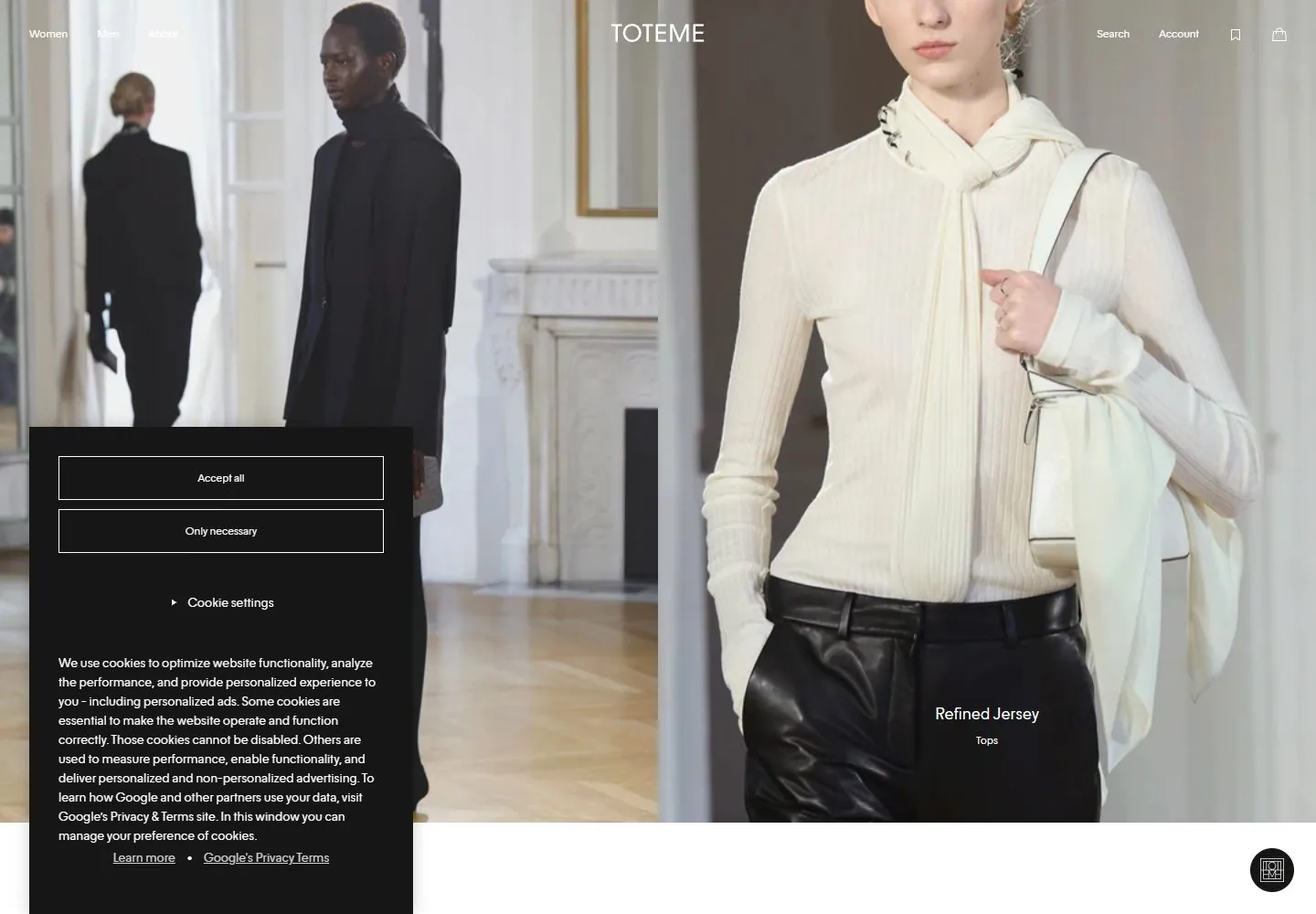
Live capture at 1440px, 2026-10-24
How it’s built
- Layout
- Two equal tall portrait crops fill the page below a thin, divided navigation row and shallow announcement strip.
- Type
- Small black regular sans navigation; no large visible heading.
- Color and surface
- White header, fine black rules and muted cream, brown and navy photography.
- Components
- Announcement, segmented navigation, utility icons and two portrait images.
What makes it work
- Thin ruled navigation above two equal tall editorial portraits.
On a new subjectFor a textile museum, show two garment details in tall equal columns beneath a ruled header.
Prompts
Create an original website image for {{website_name}} in {{industry}}, serving {{audience}}, presenting {{content}} and making {{functionality}} apparent.
INVARIANTS: Use an approximately equal full-height photographic diptych with tiny upper navigation and one modest lower-edge item label; keep visual content uninterrupted.
TYPOGRAPHY: Small pale sans labels sit far below the image scale; no large hero headline.
COLORS AND SURFACES: Use coordinated photographic values with contrasting text only where needed; avoid large opaque surfaces as style decoration.
IMAGERY: Use two original related crops with different distances. Source garments, people and the visible consent panel are incidental.
VARIABLES: Supply original identity, writing, imagery, accent hues and tasks for {{website_name}}, {{industry}}, {{audience}}, {{content}} and {{functionality}}.
PROHIBITIONS: Do not copy source branding, wording, photographs or signature artwork. Do not turn privacy notices, submission frames or cut-off essential text into style rules. Avoid generic card stacks, extra decorative panels or an unrelated large hero heading when they erase the specified hierarchy.
CONTINUATION: Translate the same relative type scale, alignment and image treatment into the next real content section; give that section a clear purpose rather than duplicating the hero.
RESPONSIVE PROPOSAL: Present the two crops consecutively with their own labels or a compact pair if legible; keep privacy notices out of the defining composition. Render clear, readable original text and subject-appropriate controls with consistent spacing. These proportions are visual reproduction targets, not common measured CSS. The selected still does not establish source fonts, technology, motion, hover or responsive behavior. Preserve those evidence limits; this prompt remains unvalidated.
Build a functioning responsive website for {{website_name}} in {{industry}} for {{audience}}, using {{content}} and working {{functionality}}.
INVARIANTS: Use an approximately equal full-height photographic diptych with tiny upper navigation and one modest lower-edge item label; keep visual content uninterrupted.
TYPOGRAPHY: Small pale sans labels sit far below the image scale; no large hero headline.
COLORS AND SURFACES: Use coordinated photographic values with contrasting text only where needed; avoid large opaque surfaces as style decoration.
IMAGERY: Use two original related crops with different distances. Source garments, people and the visible consent panel are incidental.
VARIABLES: Supply original identity, writing, imagery, accent hues and tasks for {{website_name}}, {{industry}}, {{audience}}, {{content}} and {{functionality}}.
PROHIBITIONS: Do not copy source branding, wording, photographs or signature artwork. Do not turn privacy notices, submission frames or cut-off essential text into style rules. Avoid generic card stacks, extra decorative panels or an unrelated large hero heading when they erase the specified hierarchy.
CONTINUATION: Carry the relative type scale, alignment and image treatment into appropriate content sections without repeating the hero or inventing irrelevant features.
RESPONSIVE PROPOSAL: Present the two crops consecutively with their own labels or a compact pair if legible; keep privacy notices out of the defining composition. Use semantic reading order, meaningful image descriptions, keyboard-operable controls and visible focus. Check display text bounds after the chosen fonts load at desktop and phone widths; keep complete essential text inside its container. Verify the actual requested actions rather than styling inert controls. Respect reduced-motion preferences if new motion is added. These proportions are visual reproduction targets, not common measured CSS. The selected still does not establish source fonts, technology, motion, hover or responsive behavior. Preserve those evidence limits; this prompt remains unvalidated.
Measured
Fonts loadedToteme Sans
H116px / 300
Body text16px
Page background#ffffff
Text color#090909
Page height4,168px
Computed CSS at 1440px, 2026-10-24.
Live behavior
- Today
- The live desktop landing view is a two-photo fashion diptych with a compact centered TOTEME identity and peripheral navigation/utilities. A black cookie-consent panel overlays the lower-left desktop view. t0 and t2 screenshots are pixel-identical; no no-motion conclusion follows. Hovering Women opens a large white category menu with a left text list and two product/category images at right; the consent panel remains. The scroll capture reports scrollY 750 while the Women menu remains open and product imagery underneath has advanced, so it records a scrolled page under an open overlay. Tablet and mobile replace desktop text navigation with compact menu/search/brand/utility icons. Cookie consent occupies much of both smaller screenshots, obscuring most of the underlying page.
- Responsive
- Captured at 1440×1000, 768×1024, and 390×844. Desktop shows a two-image fashion view under edge utilities. Tablet/mobile use a compact icon row with centered brand; the large consent panel takes most of the visible area and limits conclusions about underlying responsive hero or product layout.
- Scroll
- A true scroll capture reports scrollY 750. The Women mega-menu remains open in the screenshot and obscures much of the page while product images/labels beneath it have advanced. This is not a clean unobstructed reading of the scrolled page.


