
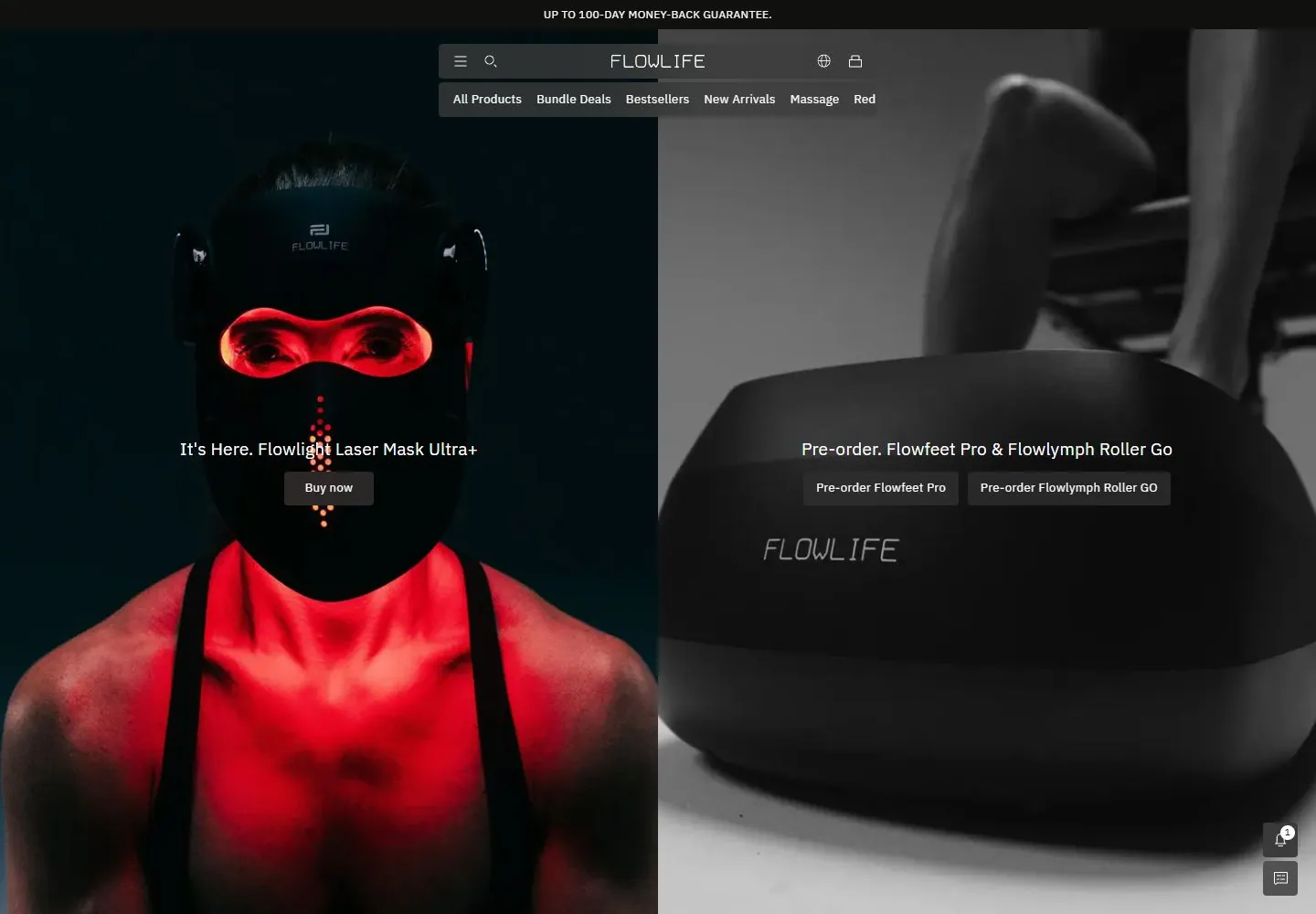
Live capture at 1440px, 2026-10-24
How it’s built
- Layout
- Full-height split image hero: grayscale equipment close-up left and red-lit person and device right; centered translucent navigation sits over the seam with small promotional copy and buttons on both halves.
- Type
- Small white regular sans navigation and medium white image captions.
- Color and surface
- Black and gray left image, warm red right image, white text and dark translucent controls.
- Components
- Announcement strip, two-tier navigation, paired image captions and buy buttons.
What makes it work
- Two contrasting full-height image panels with centered captions and controls.
On a new subjectFor a science museum, present two exhibitions as contrasting full-height image panels with centered captions.
Prompts
Create a transferable visual direction for {{website_name}} in {{industry}} for {{audience}}, presenting {{content}} and supporting {{functionality}}. Composition rule: Divide the hero into two balanced image-led panels beneath one shallow shared navigation band. Give each panel its own concise message and action, with the two image treatments coordinated but visually distinct. Type character/hierarchy: Use small clean sans navigation, short centered messages and compact readable action labels. Palette and contrast: Use dark media with clear light text; contrast the two panels through image tone or a restrained accent, not a required red/monochrome pair. Image/component hierarchy: Choose two different subject-appropriate images for {{content}}; do not require wellness products, human models or device close-ups. Visual estimate from the selected reference image, not a measured CSS value: Visual estimate: panels each 50% width and nearly 90% height; header is a narrow strip; controls small. Treat it as a flexible proportion. Variables: provide original identity, wording, imagery, hues and working actions for {{website_name}}, {{industry}}, {{audience}}, {{content}} and {{functionality}}. Source people, objects, products, exact artwork, logo shapes and text must never be required; select imagery specifically suited to the new subject. Do not infer named typefaces, technology, CSS values, effects or control behavior from a still. Continue the same scale and spacing logic into relevant lower content. Stack the two panels with their messages and actions attached; reduce image crop before hiding useful content.
Implement a responsive page for {{website_name}} in {{industry}} for {{audience}}, with {{content}} and functional {{functionality}}. Desktop layout: Divide the hero into two balanced image-led panels beneath one shallow shared navigation band. Give each panel its own concise message and action, with the two image treatments coordinated but visually distinct. Typography: Use small clean sans navigation, short centered messages and compact readable action labels. Surface contrast: Use dark media with clear light text; contrast the two panels through image tone or a restrained accent, not a required red/monochrome pair. Image and component roles: Choose two different subject-appropriate images for {{content}}; do not require wellness products, human models or device close-ups. Visual estimate from the selected reference image, not a measured CSS value: Visual estimate: panels each 50% width and nearly 90% height; header is a narrow strip; controls small. Treat it as a flexible proportion. Variables: provide original identity, wording, imagery, hues and working actions for {{website_name}}, {{industry}}, {{audience}}, {{content}} and {{functionality}}. Source people, objects, products, exact artwork, logo shapes and text must never be required; select imagery specifically suited to the new subject. Do not infer named typefaces, technology, CSS values, effects or control behavior from a still. Continue the same scale and spacing logic into relevant lower content. Stack the two panels with their messages and actions attached; reduce image crop before hiding useful content. Use semantic text, useful image descriptions, and meaningful control labels. Provide keyboard operation and visible focus for new controls. Do not implement cookie or consent overlays as part of the style; behavior shown in static reference controls remains unverified.
Measured
Fonts loadedibm
H319px / 400 / 0.19px
Body text13px
Page backgroundtransparent
Text color#ffffff
Page height8,293px
Computed CSS at 1440px, 2026-10-24.
Live behavior
- Today
- The desktop first view is a darkened full-bleed split product hero: a red-lit person wearing a device at left and a large monochrome close-up at right, with a centered narrow storefront header over the image. A centered country/welcome dialog and a lower-right cookie-consent panel obscure large parts of the hero. At t2, the right-hand image changes while the header and overlays remain. The 750px scroll capture reaches a dark aerial street scene and a short all-caps support link; the dialogs/cookie panel still obscure content. Tablet and mobile show a vertically framed hero/product image with the country dialog and cookie panel covering much of the screen.
- Responsive
- Captured at 1440×1000, 768×1024, and 390×844. Desktop uses a centered narrow nav; tablet/mobile retain a compact dark bar with menu/search, centered FLOWLIFE wordmark and utility icons. Smaller captures are heavily obscured by country and cookie overlays, so underlying responsive layout is only partly assessable. The mobile reduced-motion fresh-load shows the same general product hero with the cookie panel.
- Scroll
- A real scroll capture reports scrollY=750 in a 1440×1000 viewport. It shows the lower part of the hero, a large street-scene image, and a short support link; the country dialog and cookie consent remain overlaid. No overlay, button, or link was activated.


