
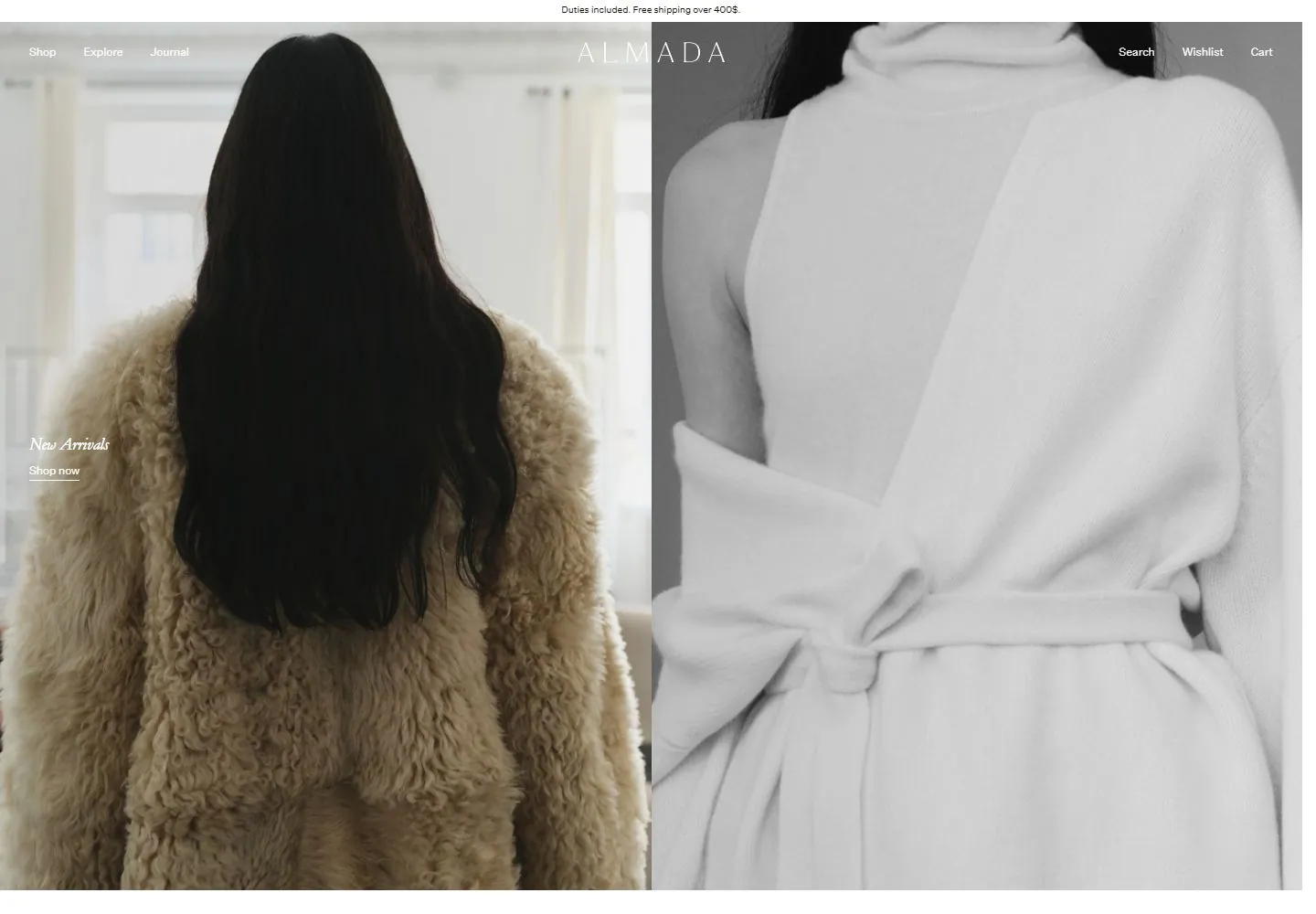
Live capture at 1440px, 2026-10-24
How it’s built
- Layout
- A black field holds a broad collage of fashion-store page fragments: a central two-model campaign image is flanked by product grids, fabric detail, process imagery and smaller editorial views. Narrow black gutters separate the irregular screenshot panels; page names and controls are visible inside the panels.
- Type
- Very small understated sans/serif store navigation and captions, with restrained letter-spaced ALMADA identity in the central panel. Exact faces and sizes are unknown.
- Color and surface
- Mostly black collage gutters around pale gray, white and neutral fashion imagery; the central black garments create a strong dark focal block.
- Components
- Irregular grid of related site-page fragments, including campaign photography, product tiles, material/process details and editorial image panels.
What makes it work
- Generous light page surfaces and margins
- Restrained store navigation and small understated captions
- Large neutral editorial or product photography
- Plain catalog grids alongside material/process or editorial views
On a new subjectFor a public library local-history archive, use calm light page surfaces, compact archive navigation and understated captions, pairing large documentary/editorial photographs with plain collection grids and occasional material or document details. Replace fashion imagery and products; build ordinary pages or views rather than a screenshot montage.
Prompts
Create an original website image for {{website_name}} in {{industry}}, serving {{audience}}, presenting {{content}} and making {{functionality}} apparent.
INVARIANTS: Place a thin navigation/identity layer across a nearly equal pair of large campaign images; keep short captions close to their image edges and let catalog content start below.
TYPOGRAPHY: Use a small fine uppercase identity and tiny sans navigation/captions; avoid a large promotional headline.
COLORS AND SURFACES: Photographs dominate, with minimal light/dark labels selected for contrast rather than opaque cards.
IMAGERY: Create a new matched image pair with a wider scene and tighter material/detail view; fashion content and the gallery surround are variables.
VARIABLES: Supply original identity, writing, imagery, accent hues and tasks for {{website_name}}, {{industry}}, {{audience}}, {{content}} and {{functionality}}.
PROHIBITIONS: Do not copy source branding, wording, photographs or signature artwork. Do not turn privacy notices, submission frames or cut-off essential text into style rules. Avoid generic card stacks, extra decorative panels or an unrelated large hero heading when they erase the specified hierarchy.
CONTINUATION: Translate the same relative type scale, alignment and image treatment into the next real content section; give that section a clear purpose rather than duplicating the hero.
RESPONSIVE PROPOSAL: Keep the image pair recognizable through a short vertical sequence, followed by captions attached to each image and then the requested catalog/content. Render clear, readable original text and subject-appropriate controls with consistent spacing. These proportions are visual reproduction targets, not common measured CSS. The selected still does not establish source fonts, technology, motion, hover or responsive behavior. Preserve those evidence limits; this prompt remains unvalidated.
Build a functioning responsive website for {{website_name}} in {{industry}} for {{audience}}, using {{content}} and working {{functionality}}.
INVARIANTS: Place a thin navigation/identity layer across a nearly equal pair of large campaign images; keep short captions close to their image edges and let catalog content start below.
TYPOGRAPHY: Use a small fine uppercase identity and tiny sans navigation/captions; avoid a large promotional headline.
COLORS AND SURFACES: Photographs dominate, with minimal light/dark labels selected for contrast rather than opaque cards.
IMAGERY: Create a new matched image pair with a wider scene and tighter material/detail view; fashion content and the gallery surround are variables.
VARIABLES: Supply original identity, writing, imagery, accent hues and tasks for {{website_name}}, {{industry}}, {{audience}}, {{content}} and {{functionality}}.
PROHIBITIONS: Do not copy source branding, wording, photographs or signature artwork. Do not turn privacy notices, submission frames or cut-off essential text into style rules. Avoid generic card stacks, extra decorative panels or an unrelated large hero heading when they erase the specified hierarchy.
CONTINUATION: Carry the relative type scale, alignment and image treatment into appropriate content sections without repeating the hero or inventing irrelevant features.
RESPONSIVE PROPOSAL: Keep the image pair recognizable through a short vertical sequence, followed by captions attached to each image and then the requested catalog/content. Use semantic reading order, meaningful image descriptions, keyboard-operable controls and visible focus. Check display text bounds after the chosen fonts load at desktop and phone widths; keep complete essential text inside its container. Verify the actual requested actions rather than styling inert controls. Respect reduced-motion preferences if new motion is added. These proportions are visual reproduction targets, not common measured CSS. The selected still does not establish source fonts, technology, motion, hover or responsive behavior. Preserve those evidence limits; this prompt remains unvalidated.
Measured
Fonts loadedHeading Font Italic, Heading Font Secondary, Paragraph Primary Font, Button Font
H114px / 400
Body text16px
Page backgroundtransparent
Text color#000000
Page height3,923px
Computed CSS at 1440px, 2026-10-24.
Live behavior
- Today
- A white border encloses a color fashion portrait left and near-monochrome garment crop right. Brand mark bridges seam, slim links sit at upper edges, and small italic New Arrivals caption overlays left. t0/t2/hover appear unchanged. Scroll at y750 reveals four-column product row with isolated light products and restrained names/prices.
- Responsive
- Desktop 1440x1000 shows paired image; tablet/mobile use one portrait hero with overlay mark and icons. Mobile follows with two category images. The sampled ordinary mobile document height is 3276 CSS px; the separate fresh preference load reports 3290 CSS px.
- Scroll
- At y750 the bottom of the paired hero remains visible along the top, and a four-column product row appears below.


