
Gallery screenshot, saved 2026-10-24
How it’s built
- Layout
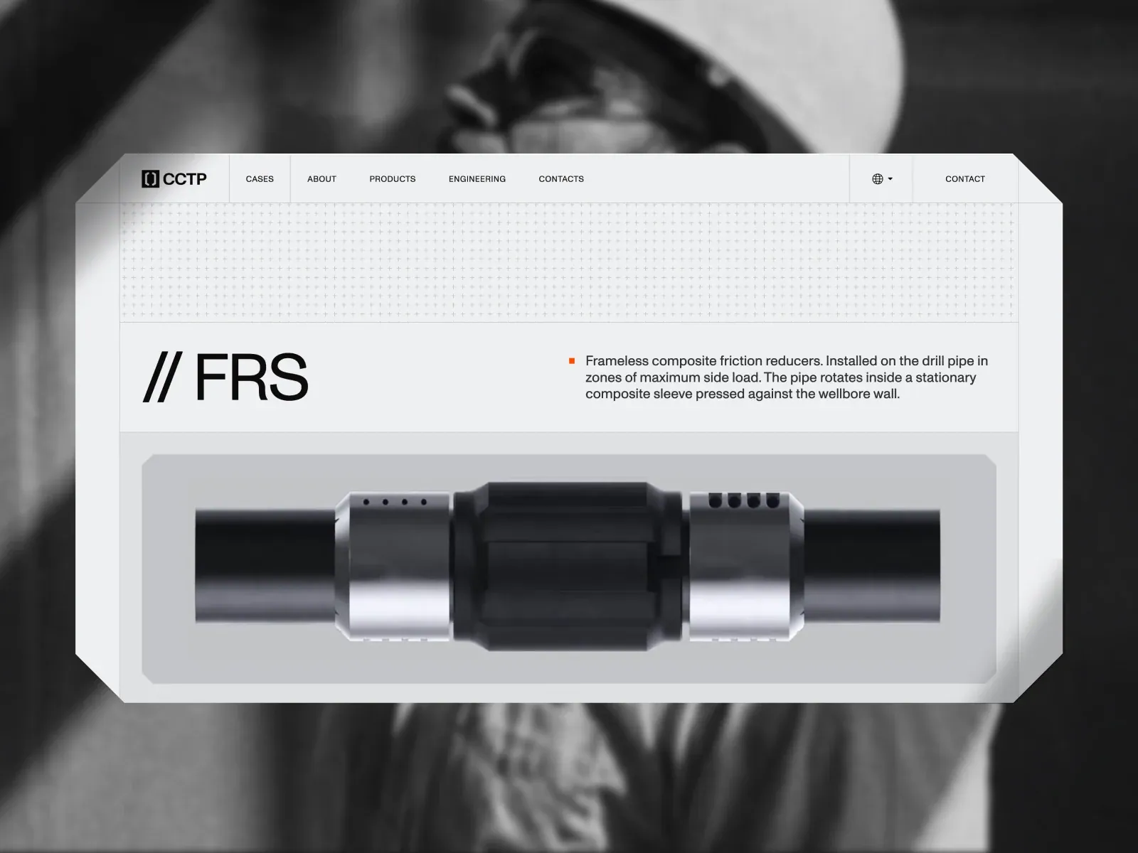
- A grayscale portrait fills the background behind a wide white angular-edged page panel. Divided navigation spans the top; a shallow plus-pattern band separates it from a two-column title/description row. A large product rendering occupies a bordered lower panel. Portrait surround may be gallery backdrop.
- Type
- Large thin sans technical title, smaller clean sans description, compact uppercase navigation. Exact font and metrics unknown.
- Color and surface
- White/light-gray panels, black type, small orange bullet, grayscale product rendering; portrait surround is uncertain framing.
- Components
- Segmented nav, patterned spacer, paired heading/explanation, large product viewport.
What makes it work
- Light modular panel
- Segmented navigation
- Separated title/explanation
- Large product viewport
On a new subjectFor a public-library archival-care guide, use segmented navigation, a concise paired heading and explanation, then a large isolated rendering of a conservation tool or archival material in its own bordered viewport; retain modular light panels and clear rules while replacing the drill-pipe product and technical claims.
Live behavior
- Today
- At desktop initial time the page shows a full-viewport charcoal loading field with a fine repeating plus-sign grid and a centered orange square beside READY. At the two-second desktop capture, this has resolved to a full-bleed close-up of dark metallic drilling equipment. A fixed dark transparent navigation bar spans the top: white bracket mark and Cyrillic CCTP wordmark at left; five compact section links; globe/language control and CONTACT at right. The hero text sits in the lower-left quadrant: “PUSHING THE LIMITS / OF DRILLING,” a three-line engineering proposition, and a bright orange chamfered VIEW CASES button with a bent-arrow icon. The hover capture remains on the same hero composition. At desktop scrollY 750, the visible viewport contains the dark hero tail, then a pale gray ABOUT US panel with a large two-line statement and orange button; below it are three equal bordered columns with thin outlined tool diagrams and headings EQUIPMENT, ENGINEERING & MODELING, and FIELD SUPPORT. The gallery reference shows a separate product page composition: monochrome blurred drilling background behind a large pale framed product panel with grid strip, oversized // FRS heading, short description and product rendering. This gallery image is not treated as a live-state capture.
- Responsive
- At 1440x1000, the fixed top navigation has measured height 70px and its inner row spans x=64 to 1376; the hero content starts at x=96. At 768x1024 the desktop navigation is replaced by a compact header with logo, language selector and MENU; the product image remains dominant and the headline wraps across two lines over it. At 390x844 the same simplified header remains, with the headline and paragraph left-aligned at x=32 over a tightly cropped equipment close-up; VIEW CASES sits below the text. The viewport document widths equal the tested viewport widths (390, 768, 1440); captured total document heights are 14817, 18561, and 14234 CSS px respectively. Only the top-level responsive states and one desktop scroll position are captured.
- Scroll
- A single desktop scroll capture is recorded at scrollY 750. It reveals the boundary from hero into the pale ABOUT US area and the start of the three-column equipment/services row. No further scroll positions, sticky transition sequence, or footer state were captured. Mobile and tablet captures are at scrollY 0.


