
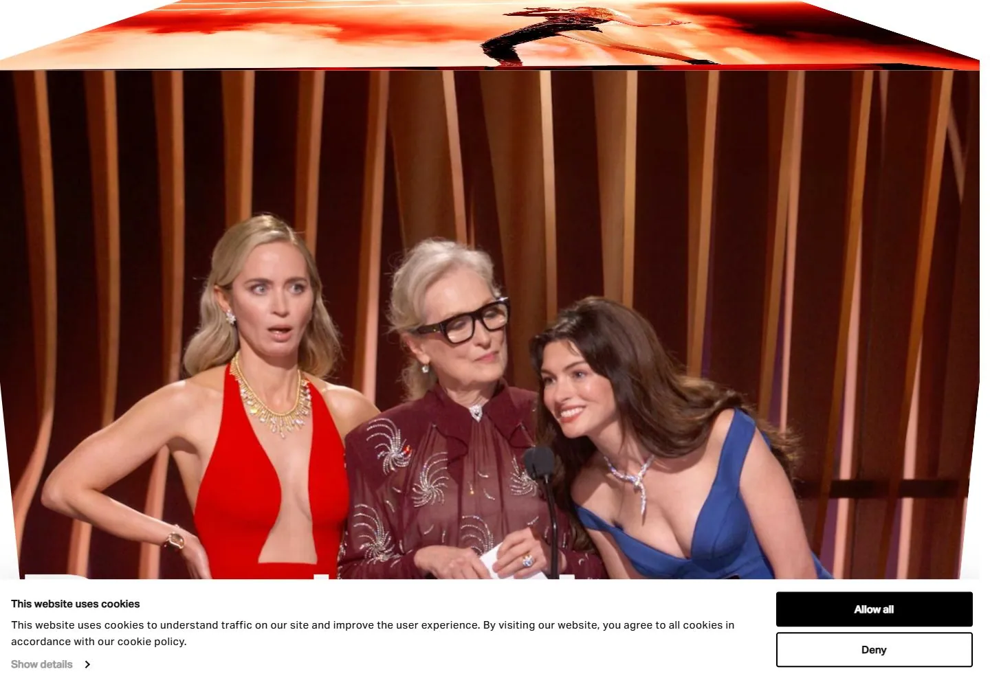
Live capture at 1440px, 2026-10-24
How it’s built
- Layout
- A white bounded page places identity upper left and a compact header across the right. A medium-large black multi-line statement occupies the upper-right half, leaving the left blank; a small browse label and full-width performance image occupy the lower band. Color gradient exterior is staging.
- Type
- Regular sans statement with close line spacing, small plain sans navigation and large white image-overlay labels. Exact fonts and metrics unknown.
- Color and surface
- White field, black text and vivid dark blue/pink stage photograph.
- Components
- Use a broad white field with a left-aligned multi-line statement positioned in the right half, empty left half and wide cinematic image band below, with compact header.
What makes it work
- White field and asymmetrical right statement
- Broad blank left region
- Wide lower image band
- Compact top navigation
On a new subjectFor a public wildlife rescue service, put a concise right-side mission statement on white over a wide original field-rescue photograph, preserving the empty left region and compact header.
Measured
Fonts loadedaktiv_grotesk
H154px / 450 / -2.16px
Body text18px
Page backgroundtransparent
Text color#000000
Page height11,470px
Computed CSS at 1440px, 2026-10-24.
Live behavior
- Today
- Silent House desktop t0 is an intro: large separated Silent/House words flank a small folded arrangement of photographic panels on white. Later desktop states show a conventional compact header, left-aligned four-line statement positioned in the right half, broad empty left region and large performance-video band below. Typography is plain tightly spaced black sans. A wide consent panel masks the bottom. This current copy and moving sequence are separately versioned from the selected gallery composition.
- Responsive
- At1440px the visible post-intro statement occupies the right half beneath full header text navigation; at768px the statement moves to a nearly full-width top block below identity/hamburger and uses two lines. At390px it remains full-width but wraps to four lines above video and a visible beginning of the numbered service section. Tablet consent becomes a broad centered modal-like panel with horizontal actions; mobile consent stacks actions and covers the middle of the page. Narrow heading computes32px rather than54px desktop. These sampled widths do not define all breakpoints.
- Scroll
- Actual desktop scroll reaches750px in a11470px document. Video now fills most upper viewport, a white Play Reel label/triangle overlays its left, and a numbered Studios row appears below with a large left service label and right explanation/link. Header is not visible in this screenshot even though the earlier header computes fixed; do not infer always-visible sticky navigation from CSS alone. Consent still masks lower service content.


