
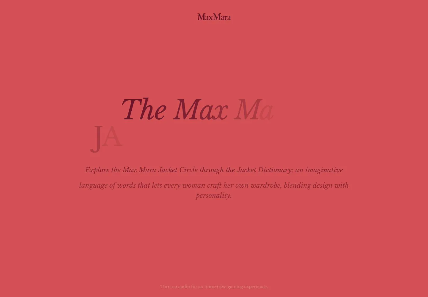
Live capture at 1440px, 2026-10-24
How it’s built
- Layout
- A pink hand-drawn city street scene fills the image, with fine red architectural outlines, tiny people and cars, selective yellow-green highlights and a centered burgundy title combining italic mixed case with uppercase serif. A small serif brand appears at top. No webpage controls are visible; UI membership is unknown.
- Type
- Large high-contrast serif title with italic first word and upright uppercase second; smaller centered serif identity. Exact font and metrics unknown.
- Color and surface
- Pink textured ground, red line drawing, dark burgundy type and sparse yellow-green highlights.
- Components
- Center an italic-and-upright burgundy serif title over a pink hand-drawn street scene with fine red outlines and selective yellow-green highlights.
What makes it work
- Pink textured hand-drawn street scene
- Fine red architectural outlines and sparse yellow-green highlights
- Centered burgundy serif title mixing italic and uppercase upright
- Small centered identity
On a new subjectFor a public city-history exhibit, center an italic-and-upright burgundy serif title over an original pink hand-drawn street scene with fine red outlines and selective yellow-green highlights.
Measured
Fonts loadedInter, Libre Baskerville
H112px / 400
Body text16px
Page background#fafafa
Text color#2c2e2c
Page height1,000px
Computed CSS at 1440px, 2026-10-24.
Live behavior
- Today
- A blush-pink illustrated street fills the background with soft red pencil/watercolor outlines near the edges and a quiet pale center. A small dark-wine identity sits top center. A large two-line serif title pairs italic mixed case above regular uppercase, followed by centered italic description. Most ordinary frames have a black consent panel covering the bottom. Fresh phone reveals a small pale-yellow rounded Start the Experience button with wine outline/drop offset, and a short serif audio invitation below. Main creative appearance is storybook editorial rather than a product-card interface.
- Responsive
- Title88.5px/88.5px desktop becomes47.2px tablet and36.4px phone, with italic/regular contrast retained. Desktop italic description22.5px/33.75px changes12px/18px tablet and18.72px/27.04px phone; do not assume a monotonic scale because these are directly different captured rules. Tablet title sits lower within a tall pink scene. Phone places title near y278 and description beneath, but ordinary description is mostly hidden by consent from y402.5. Fresh phone exposes the full multi-line description, button around88,700 with roughly214x40px measured bounds, and bottom audio prompt. Ordinary phone consent hides button/audio entirely. Canvas element is250% viewport width/height with negative x, so its huge bounds are not a page overflow claim or visible scene size.
- Scroll
- Attempted desktop scroll leaves actual scrollY0 and document1440x1000; title remains while illustrated edges change slightly. This does not establish successful page scrolling or additional game scenes. No underlying content is exposed beyond the introductory state.


