
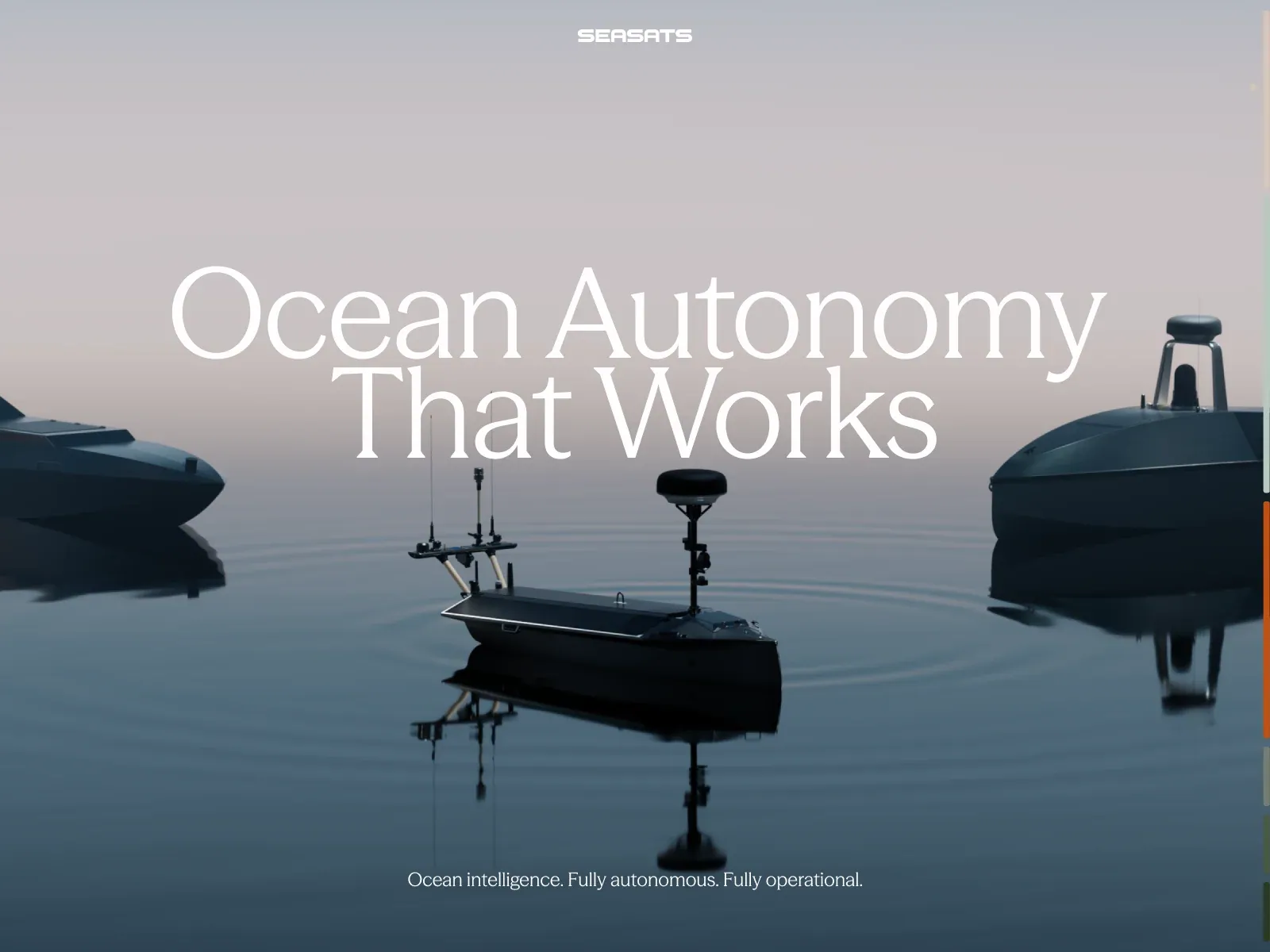
Screenshot from Awwwards, saved 2026-10-24
How it’s built
- Layout
- Full-bleed muted seascape places a small dark surface craft near lower center and larger vessel forms at both sides. Horizon lies just above mid-frame under pale gray-pink sky. Large centered two-line white serif title sits above vessels, compact white mark at top center and short serif tagline near bottom. Narrow colored strips appear at far right; function/provenance unknown.
- Type
- Large fine-stroked centered serif display; compact uppercase geometric-looking wordmark; small serif supporting line. Exact face and metrics unknown.
- Color and surface
- Low-saturation slate-blue water/boats, mauve-gray sky, dark craft and white text; edge has thin colored strips.
- Components
- Top-centered wordmark, large title, maritime image, short tagline, colored edge indicators.
What makes it work
- Muted expansive environmental field with low dark focal objects and reflections.
- Oversized fine-serif centered statement with sparse identity/support.
On a new subjectFor a furniture craft collection, photograph original dark sculptural chairs reflected in a quiet studio floor beneath a soft open backdrop. Set a large fine-serif two-line collection statement in the open center and keep identity and support small. Preserve sparse atmospheric contrast; replace all maritime imagery.
Live behavior
- Today
- The captured Seasats landing page places a large vessel-at-sea image inside a rounded main panel, with the compact Seasats mark at upper left and a tall menu along the right edge. The main headline “Ocean Autonomy That Works” is set in large white serif type over a pale sky above the vessel, and an Explore Products control appears near the lower center. The side menu uses stacked muted-color sections for Home, Capabilities, Past Missions, Products and product subcategories, Leadership, Careers, Press and Contact. The desktop-scroll image at y=750 shows a different vessel frame and the side menu without the main headline in the viewport. Tablet and phone show narrower crops with the menu still visible; the reduced-motion phone frame is more tightly cropped and includes MENU. The gallery image is a separate fullscreen title treatment with centered headline and no visible side menu.
- Responsive
- Desktop states measure 1440×1000 with a 1440×36795 document; desktop-scroll records actual y=750. Tablet is 768×1024 with a 768×35459 document. Both phone states are 390×844 with 390×28076 documents at y=0. The right-side menu remains a distinct vertical column on the desktop and tablet captures, while phones show a narrower image/menu arrangement and the reduced-motion frame exposes a MENU label. Animation counts rise from eleven in desktop t0/t2/hover to twelve at desktop-scroll and twenty-five in tablet and both phones; reduced-motion is true on the final phone state. The counts do not establish preference support or breakpoints.
- Scroll
- The desktop-scroll state records actual scrollY=750 in a 1440×36795 document. The main title is no longer visible; the screenshot shows a vessel in calm water in the large left panel, a small image preview near its upper right, and the vertical pastel navigation panel. This describes that captured position only.


