
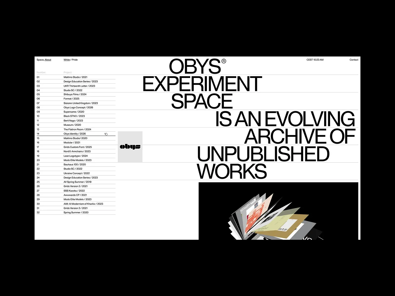
Gallery screenshot, saved 2026-10-24
How it’s built
- Layout
- A white editorial page is centered inside a broad black surround. Small links, clock and contact sit along the top. A narrow numbered project list runs down the left; the much larger right area is occupied by enormous black uppercase sans text broken across lines: OBYS EXPERIMENT SPACE IS AN EVOLVING ARCHIVE OF UNPUBLISHED WORKS. Thin horizontal rules align with lines in the text and project list. Near the lower edge, a gray project tile and a large black image field with fanned graphic sheets begin. The black outer surround is presentation framing rather than part of the white page unless independently verified.
- Type
- Large tightly set uppercase sans dominates the right side and is broken into short stacked lines; the project list and nav are tiny sans. Exact font metrics are unknown. The line rules reinforce the text's broad horizontal rhythm.
- Color and surface
- Nearly monochrome white page, black typography/rules, pale gray project tile and black lower media panel. Outer black surround frames the white page and remains uncertain site context.
- Components
- Top utility row; numbered project list; oversized editorial statement; aligned hairline rules; lower project/image modules beginning at crop.
What makes it work
- Light monochrome page
- Narrow numbered project index
- Dominant oversized statement in a separate broad zone
- Shared horizontal alignment/rhythm between list and statement
On a new subjectFor an unrelated culinary school, pair a narrow numbered course index with a large original statement about its teaching approach on a light page, using aligned rules to connect the zones. Let selected food imagery begin beneath the statement and replace studio identity, archive claim and projects.
Live behavior
- Today
- The original site was not visually accessible in the dated browser capture: title “403 Forbidden - Nginx”, with a generic access-denied message. The six saved images show the same centered 403 panel at desktop, tablet, and mobile sizes. This is a reference-only visual description; it does not verify the original page or any behavior.
- Responsive
- Measured 1440×1000, 768×1024, and 390×844 viewports. In all six measurements, the document width and height equal the viewport and scroll_y is 0. The displayed content is the same 403 response at each size. The labels desktop-scroll, desktop-t0, and desktop-t2 do not correspond to distinct visible site states; their screenshot bytes are identical, and desktop-scroll is measured at scroll_y 0. These captures reveal no responsive behavior of the website.
- Scroll
- The state named desktop-scroll is measured at scroll_y 0 with document height equal to the viewport. It records no site content below the fold and does not demonstrate scroll behavior.


