
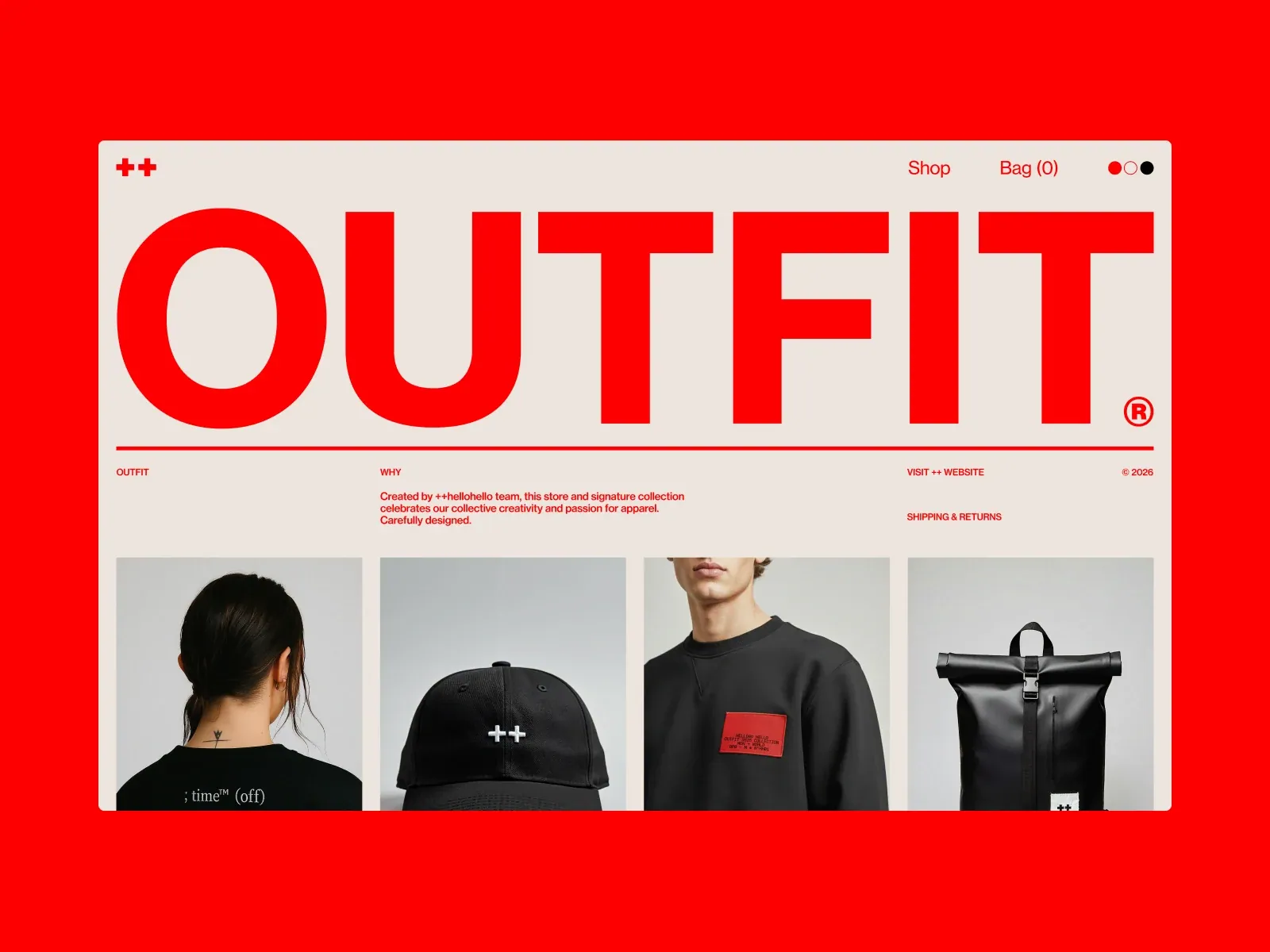
Gallery screenshot, saved 2026-10-24
How it’s built
- Layout
- A pale bounded shop page has a tiny red plus mark at upper left and shop/bag links at upper right. Huge red uppercase OUTFIT dominates the width above a red rule; tiny red descriptive columns sit beneath, followed by a four-column row of product photos. Exterior red is presentation context.
- Type
- Very large heavy geometric uppercase sans, with much smaller compact sans text and simple utility links. Exact font and metrics unknown.
- Color and surface
- Warm pale gray field, vivid solid red type/rule, neutral photographic cards with black clothing.
- Components
- Compact header, huge wordmark, rule, small informational columns and four image tiles.
What makes it work
- Pale ground and oversized red uppercase wordmark
- Red dividing rule
- Small red information columns
- Aligned photographic tile row
On a new subjectFor a municipal volunteer recruitment program, use an oversized red uppercase campaign title on a pale field, red rule, compact information columns and a row of original volunteer portraits.
Live behavior
- Today
- The storefront pairs an oversized red OUTFIT wordmark and red interface text with a warm off-white field, a fine horizontal rule and a compact introduction. Product photography forms a four-column desktop row below, with sparse names, prices and category markers. Header controls include the ++ mark, Shop, Bag and color dots. The scrolled frame shows additional product images at differing sizes.
- Responsive
- At 1440×1000 the first product row has four columns; the 768×1024 and 390×844 frames show two columns. The introduction reflows and the mobile header shows Bag and Menu in place of the desktop Shop and color dots. The tablet measurement records document width 784 CSS px versus viewport width 768; this measurement alone does not establish a user-visible horizontal-scroll defect. These are sampled widths, not exact breakpoint measurements.
- Scroll
- The desktop-scroll measurement records actual scrollY 750 CSS px in a 1440×4061 document. Its screenshot shows product names and prices and additional differently sized product images; the top navigation remains visible in the viewport. The two stills do not establish its positioning mechanism or complete scroll transition.


