
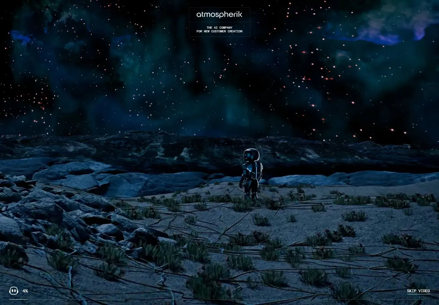
Live capture at 1440px, 2026-10-24
How it’s built
- Layout
- Within the bounded panel, a softly blurred teal nighttime environment supports enormous white left-aligned two-line copy and a small explanation. A polished friendly dimensional character fills the right, holding a luminous fine-lined object. A small boxed brand descriptor sits upper right; a compact translucent-looking navigation dock floats at bottom center. Tiny corner copy/scroll cue remains subordinate. Outer teal blur is presentation framing.
- Type
- Huge normal-case clean sans title, small sans explanation and tiny monospaced-looking brand/dock labels. Exact fonts unknown.
- Color and surface
- Deep teal/black background, soft bokeh depth, glossy dark character with cyan rim lights, white typography and a small warm luminous accent in the held object.
- Components
- Atmospheric scene, large friendly character, left proposition/support, corner brand box and floating lower navigation dock.
What makes it work
- Dark atmospheric field with soft depth blur
- Dominant friendly dimensional character with sharp rim/material detail
- Very large simple white left message
- Compact floating navigation at lower center
On a new subjectFor a city recycling education portal, use an original friendly sorting character in a softly blurred evening depot scene, with crisp cyan rim detail, a small glowing material sample and a huge white left mission line. Keep a compact lower topic dock; replace AI branding and test controls separately.
Measured
Fonts loadedGeist, Geist Mono
H1139.968px / 400 / -8.39808px
Body text16px
Page background#02090c
Text color#f3f5f4
Page height1,000px
Computed CSS at 1440px, 2026-10-24.
Live behavior
- Today
- The ordinary saved sequence is an edge-to-edge dark cyan/blue cinematic robot scene with a small centered image identity/tagline at the top and tiny percentage/progress/skip controls near the bottom. The fresh preference phone instead exposes a left-aligned white sans statement, supporting copy, a translucent consent panel and a compact lower navigation over the imagery.
- Responsive
- Ordinary tablet and phone crop the cinematic scene more tightly around the character while retaining top identity and bottom controls. The fresh phone is a different initialization/content phase: its identity shifts left and text/navigation become observable. It is not a controlled mobile responsive comparison with the earlier desktop intro.
- Scroll
- The desktop scroll-labelled capture remains at scrollY0 with a document height equal to the1000px viewport; the cinematic scene continues. It does not prove a successful scroll or a scroll-driven scene transition. Underlying header/nav DOM sampled during the intro can be occluded by the cinematic layer.


