
Live capture at 1440px, 2026-10-24
How it’s built
- Layout
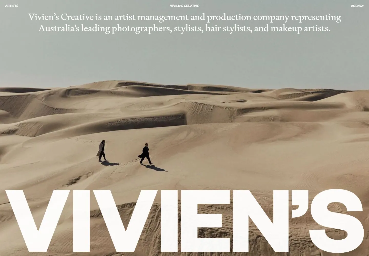
- Muted grayscale portrait of a person and horse fills the frame; giant bold white uppercase identity runs across the bottom, with small centered serif copy near the top and tiny corner navigation.
- Type
- Giant heavy uppercase sans identity, small white serif copy, tiny corner labels.
- Color and surface
- Muted gray photographic-looking field and white type.
- Components
- Full-frame image, oversized bottom identity, centered small serif copy and corner navigation.
What makes it work
- Muted full-frame image
- giant white uppercase bottom identity
- small centered serif copy
- tiny corner labels
On a new subjectFor a ceramics archive, place a muted full-frame image of a potter and clay forms behind giant white uppercase bottom identity, with small centered serif copy and tiny corner labels.
Measured
Fonts loaded__MessinaSans_fee2dc, __Signifier_1cde07
Body text16px
Page backgroundtransparent
Text color#000000
Page height1,000px
Computed CSS at 1440px, 2026-10-24.
Live behavior
- Today
- Vivien’s Creative opens with small uppercase navigation labels at the upper left, center, and right, a large centered white serif statement about the agency, and a full-screen fashion photograph behind both. The desktop hero changes between a model against vivid red fabric and a seated woman in a pale studio; enormous white VIVIEN’S lettering is cropped along the bottom edge. Tablet and phone keep the three-part navigation and statement over portrait-oriented fashion photography, with the oversized brand lettering continuing near the bottom.
- Responsive
- At 1440×1000 the statement spans two centered lines above a wide hero photograph. At 768×1024 it wraps across three lines over a portrait fashion image, and the VIVIEN’S wordmark is cut by the lower edge. At 390×844 the statement wraps across several lines over a tall image, with the large wordmark visible below the figure. The sampled dimensions do not establish exact responsive breakpoints.
- Scroll
- The state labeled desktop-scroll has actual scrollY 0 in its measurement. It therefore does not establish a scrolled-page view. Its screenshot is treated only as the captured desktop hero state.


