
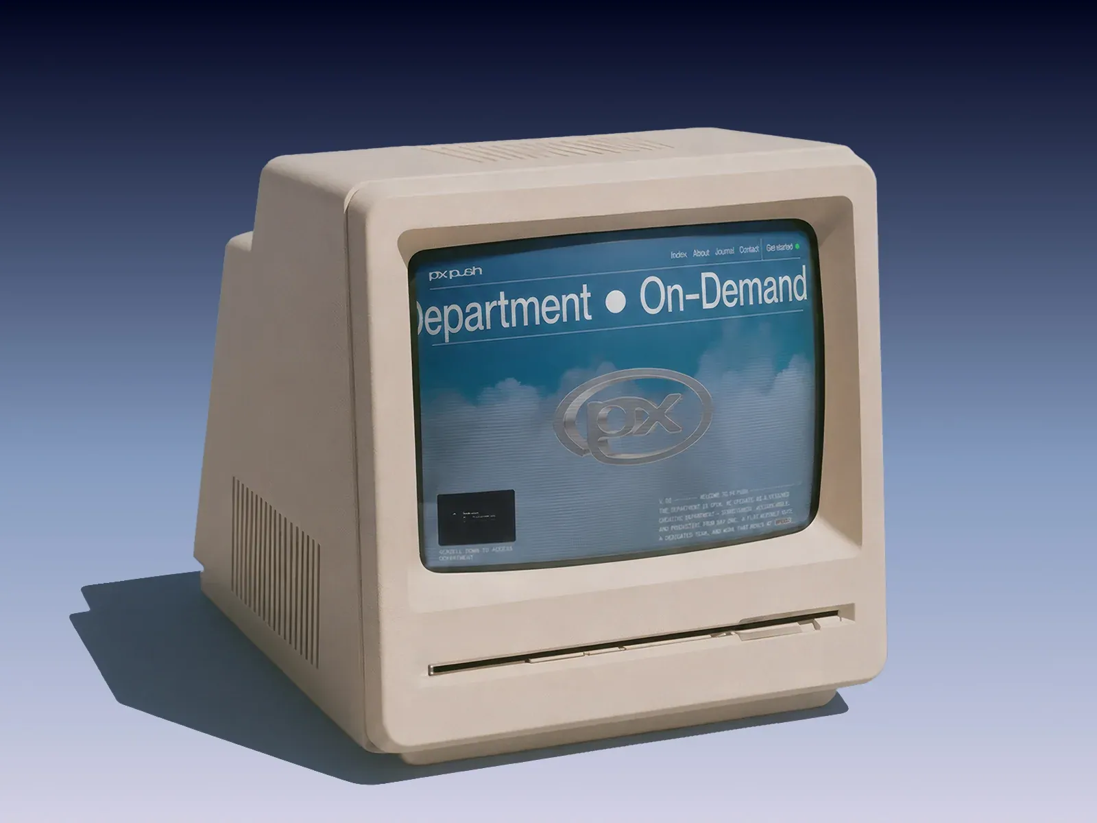
Gallery screenshot, saved 2026-10-24
How it’s built
- Layout
- A cream retro computer fills the gallery image. Its screen shows a blue-green site page with tiny brand/navigation, oversized white service heading separated by a dot, a large central emblem, and compact descriptive copy near lower right. Device and studio backdrop are presentation framing.
- Type
- Large light sans service headline, tiny compact sans navigation/body. Exact face and metrics unknown.
- Color and surface
- Within screen: blue/teal gradient, pale type and muted glossy emblem. Computer and studio are framing, not website surfaces.
- Components
- In-screen brand/nav, oversized service phrase, central emblem, short supporting copy.
What makes it work
- Oversized service headline
- Central emblem
- Compact navigation/support
On a new subjectFor a municipal library public Wi-Fi program, use a concise service line split by a small dot, a central Wi-Fi emblem, compact support near the lower edge and small navigation on a blue-green page. Replace the push-service identity and omit retro-computer framing.
Live behavior
- Today
- In the 2026-10-29 live capture, the home page opens on a cool blue sky and cloud scene with a centered metallic PX mark. Fine horizontal scan lines and a soft dark edge frame the scene. A very large white “On–Demand Design Department” line is clipped at both viewport edges between thin horizontal rules; a fixed compact header puts the PX PUSH mark at upper left and Index, About, Journal, and Get started at upper right. A small video preview and “SCROLL DOWN TO ACCESS DEPARTMENT” cue sit at lower left; a short all-caps service description sits at lower right. At the 750px scroll sample the scene gives way to a pale gray section: the fixed header remains, a black PX PUSH ticker spans between rules, and a numbered intro label and large paragraph enter view. The scroll frame does not reach the bottom of the page.
- Responsive
- At 1440x1000 the hero heading is extremely wide and edge-clipped, with the metallic mark centered and the supporting video and copy anchored to opposite lower corners. At 768x1024 the same hierarchy remains, the top navigation is still visible, and the central mark and lower copy occupy a tighter, more crowded viewport. At 390x844 navigation collapses to a Menu button; the large heading remains horizontally clipped, the mark sits around mid-screen, and the video preview/cue and small copy stack near the bottom. These three sampled widths do not establish breakpoint thresholds or all mobile behavior.
- Scroll
- The explicit desktop scroll sample reached scrollY 750 in a 11635px-tall document. Its screenshot visibly shows the pale intro section and repeated PX PUSH ticker, with the fixed top navigation still present. This is evidence of a scroll-dependent view transition, not a complete section inventory or a full-page scroll test.


