
Live capture at 1440px, 2026-10-24
How it’s built
- Layout
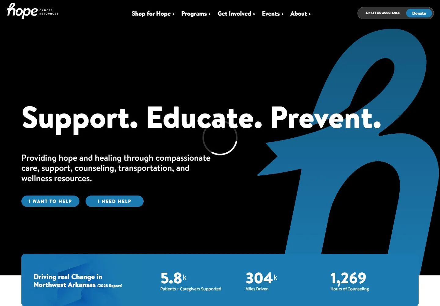
- Full-bleed photograph of two people embracing, with a darkened overlay for legible white header and copy. The Hope Cancer Resources mark is at upper left; primary navigation runs across the top, ending with assistance and Donate controls at right. Large “Support. Educate. Prevent.” statement spans the center-left; supporting copy and paired help actions sit below it. A huge blue ribbon-like form dominates the right. A broad blue metrics strip overlaps the lower image and is followed by a white two-column section entering below.
- Type
- Large heavy rounded sans statement; white body copy; compact white nav and uppercase pill-button labels. Exact face/metrics unavailable in this gallery version.
- Color and surface
- Warm human photograph with dark overlay, saturated blue ribbon and blue metrics panel, white copy; white next section begins below.
- Components
- Brand/nav and giving actions; human-image hero; large ribbon symbol; headline/support/actions; metrics strip; next explanatory section.
What makes it work
- Human contextual image
- Mission statement and concise support
- Recognizable large symbol
- Clear paired actions
On a new subjectGround an unrelated mission statement in a relevant human image, pair it with one distinctive symbol and clear actions, then place useful proof/details in a contrasting band below. Replace sensitive and organization-specific content.
Measured
Fonts loadedBrandonText, SourceSans, EightiesComebackIt
H1100px / 800
Body text10px
Page backgroundtransparent
Text color#0e1829
Page height5,652px
Computed CSS at 1440px, 2026-10-24.
Live behavior
- Today
- Hope Cancer Resources saved hero has a black field, enormous blue script-like h-shaped identity form cropped at right, large heavy rounded white sans statement at left, smaller white support and two blue pill actions. A white script identity sits upper left, heavy white desktop navigation in the middle and assistance/donation controls upper right. An inset rounded blue impact strip overlaps the bottom transition to white. A restricted-content verification error overlays the hero; this is unavailable media, excluded from design DNA.
- Responsive
- Tablet reduces header to identity/hamburger while retaining blue mark, single-line50px heading and paired blue actions. Phone uses three heading lines, narrower support column and vertically stacked pill actions with roughly43px left inset; the enlarged blue mark crops heavily behind. The unavailable media error clips across both narrow widths. The impact strip just enters phone bottom; unseen lower-phone layout is not inferred.
- Scroll
- Actual desktop scroll750/document1440x5675 brings the blue impact strip to near top, followed by white introduction split between bold blue-gray lead paragraph and regular dark prose, then three unboxed icon-led service columns. Header changes to a compact centered rounded translucent gray navigation capsule with dark labels/blue controls and a small blue script mark at upper left. Sticky/scroll timing mechanism is not specified from two states.


