
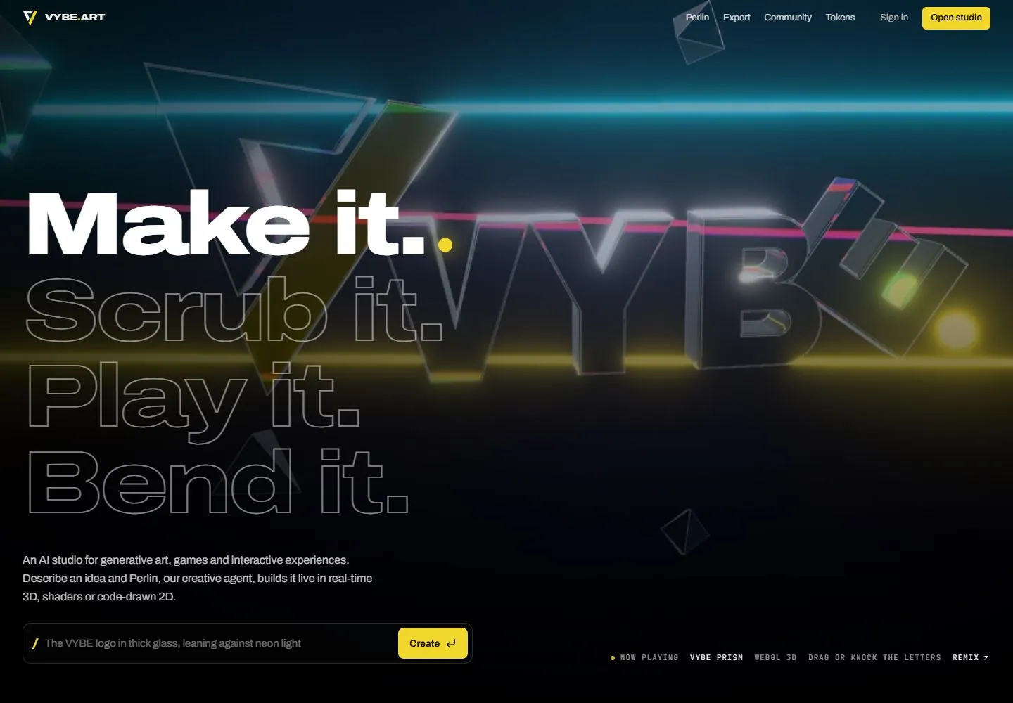
Live capture at 1440px, 2026-10-24
How it’s built
- Layout
- A dark blue-black page has a tiny corner brand and compact right navigation/action. A large glass-like outlined dimensional identity leans across the upper-right half amid horizontal cyan, magenta and yellow light bands and small faceted forms. Huge left text stacks one filled white line above two outlined lines; supporting copy and a narrow prompt/action field sit below, with a tiny technical-looking status strip at lower right.
- Type
- Extremely large heavy sans filled and outline text contrasts with tiny sans navigation/body and tracked monospaced-looking status labels. Exact fonts unknown.
- Color and surface
- Deep blue-black ground, transparent/reflective-looking object edges, luminous thin cyan/magenta/yellow bands, white filled/gray-outline type and yellow action accents. No material or rendering technology is verified.
- Components
- Small header, dimensional identity and faceted objects, horizontal light bands, filled/outline statement stack, supporting copy, prompt field/action and compact status strip.
What makes it work
- Dark field with glass-like dimensional identity
- Thin contrasting luminous horizontal bands
- Oversized filled and outlined type hierarchy
- Compact controls with isolated bright action accent
On a new subjectFor an astronomy learning lab, use an original glass-like orbital emblem crossing thin light bands, paired with huge filled and outline lesson-theme words on dark. Keep a compact topic-search field and bright action below; replace AI studio copy and verify any interactive scene separately.
Measured
Fonts loadedArchivo, JetBrains Mono, JetBrains Mono Fallback
H1125px / 800 / -4.375px
Body text16px
Page background#070707
Text color#f4f3ef
Page height14,578px
Computed CSS at 1440px, 2026-10-24.
Live behavior
- Today
- Dark hero with neon lines and reflective angular lettering behind a four-line display: one line filled white and the others outlined. Yellow actions, small navigation and an input sit over the scene.
- Responsive
- Tablet and phone retain the stacked display and input; phone replaces navigation links with a menu. Different scene and active line appear at narrower captures, with timing confounded.
- Scroll
- At scrollY 750 a large Fresh off the canvas heading and visual cards appear under the retained header.


