
Gallery screenshot, saved 2026-10-24
How it’s built
- Layout
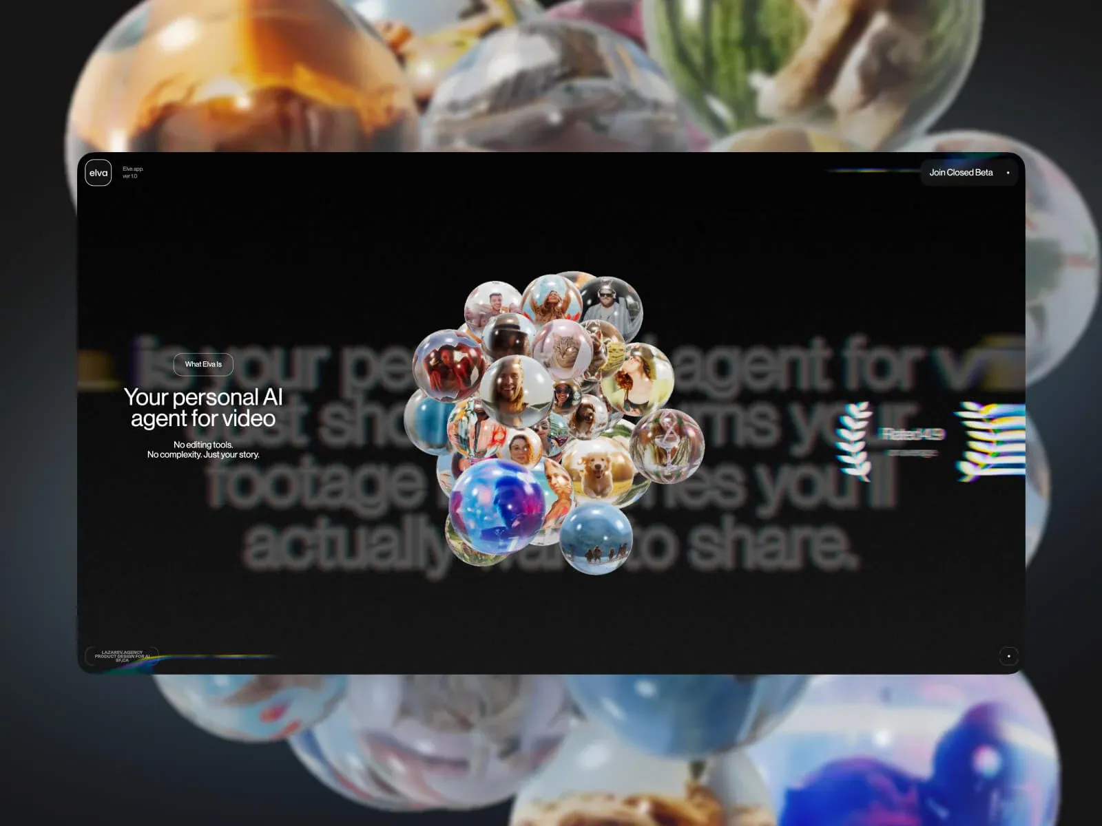
- A large rounded black panel is inset over oversized blurred photographic spheres, which continue beyond its edges. Inside the panel, an identity/version label sits upper-left and a beta action upper-right. A short outlined category cue and two-line promise occupy the left; very large deliberately blurred lettering stretches behind a sharp, central cluster of glossy photo-filled spheres. The inset panel, blurred lettering and sharp foreground cluster form distinct depth layers; the outer sphere backdrop remains separate and may be presentation framing.
- Type
- Medium-large white sans headline; small sans support and identity labels; distant oversized text intentionally blurred. Exact metrics unknown.
- Color and surface
- Near-black inset panel with white type; the blurred oversized page lettering is low-contrast and sits behind the crisp, colorful reflective sphere cluster. Chromatic fringe accents appear near edges. The enlarged photographic spheres outside the panel are a separate surrounding layer and are not attributed to page CSS.
- Components
- Rounded dark panel; low-contrast oversized blurred lettering across its field; sharp central cluster of photo-filled spheres; compact left promise/category cue; identity/version and beta action at top corners.
What makes it work
- Contained dark rounded page field
- Oversized blurred lettering behind a sharply focused dimensional cluster
- Short left-side promise and small category cue separated from the central cluster
On a new subjectFor a blood-donation campaign, place original donor/community portraits in one crisp sculptural cluster over a large, defocused typographic field inside a dark contained panel; keep the eligibility promise and category cue to the left and sign-up action at the top. Preserve the sharp-over-blurred depth relationship while replacing source wording, faces and imagery.
Live behavior
- Today
- The Oct 29 desktop captures show a dark photographic background with an oversized phone mockup centered in the viewport. The phone screen contains a close-up portrait, a small circular mark, and centered white copy reading “Meet Elva. A filmmaking crew in your phone.” with a short supporting line. Small Elva and “Try Yourself” controls sit at the top corners. At tablet width, a separate visible section shows “Upload your videos and photos.” above overlapping phone mockups. The ordinary phone capture shows a phone mockup and this section heading, while the reduced-motion phone frame returns to the portrait-led Elva hero. The desktop scroll screenshot at actual y=750 contains extremely large overlapping page text; it is recorded as the captured state rather than treated as a clean intended layout.
- Responsive
- The Oct 29 desktop t0/t2 frames are 1440x1000 with 1440x2644 measured documents; the tablet frame is 768x1024 with a 768x4770 document; the ordinary mobile frame is 390x844 with a 390x3036 document; the reduced-motion mobile frame is 390x844 with a 390x3980 document. The sampled tablet/mobile captures show different section and phone-mockup arrangements. The separate source-record Oct 24 phone screenshot is only a 70% loader frame, so it does not establish the full responsive layout. These are sampled widths, not a complete breakpoint map.
- Scroll
- The Oct 29 desktop-scroll state records actual scrollY 750 at 1440x1000 and a 1440x2644 document. Its screenshot shows oversized page text layered over the portrait-led hero, with extensive overlap. This single sample does not establish a complete page sequence or intended scroll transition.


