
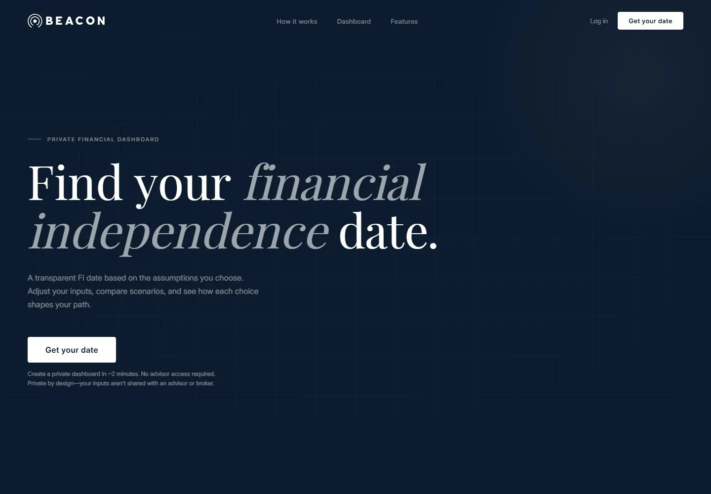
Live capture at 1440px, 2026-10-24
How it’s built
- Layout
- Dark navy field with faint grid; large left high-contrast cream serif statement with muted italic word, quiet gray support, white rectangular action and compact header.
- Type
- Large high-contrast cream serif statement with a muted gray italic emphasis; small gray sans support and tiny tracked eyebrow.
- Color and surface
- Deep navy field, faint tonal grid, cream headline, muted gray support and white rectangular actions.
- Components
- Compact horizontal header, eyebrow, large left statement, short support, rectangular primary action and small arrow link.
What makes it work
- Large cream serif statement with muted italic emphasis over a navy technical grid.
On a new subjectFor a historical atlas archive, set a cream serif statement with muted italic emphasis over a navy coordinate grid and restrained white rectangular action.
Measured
Fonts loadedInter, Playfair Display
H196px / 400 / -0.48px
Body text16px
Page background#0d1b2e
Text color#ffffff
Page height5,774px
Computed CSS at 1440px, 2026-10-24.
Live behavior
- Today
- Beacon opens on a dark navy grid with a compact logo/navigation row, a small uppercase “PRIVATE FINANCIAL DASHBOARD” label, and a large serif headline, “Find your financial independence date.” The words “financial independence” are italicized in a muted lighter tone. Supporting copy and a white “Get your date” action sit beneath it. Desktop and tablet have a broad left-aligned composition; mobile wraps the headline into four lines.
- Responsive
- The measured document is 1440×5774 desktop, 768×6446 tablet and 390×7324 phone. The dark gridded hero persists at all sampled sizes. Desktop has centered full navigation and a left-aligned headline; tablet and phone replace the nav links with a menu icon. The phone stacks the headline, supporting copy, full-width action and privacy note. At scrollY=750, desktop shows a pale “How it works” section with three colored cards. Samples do not establish breakpoints or full behavior.
- Scroll
- The desktop-scroll state records actual scrollY=750 in a 1440×5774 document. It shows the pale “HOW IT WORKS” section, headline “Three inputs. One clear plan.” and three numbered cards: “Set your starting point,” “Choose your assumptions,” and “See your next move.” The top navigation remains visible. No card or call to action was used.


