
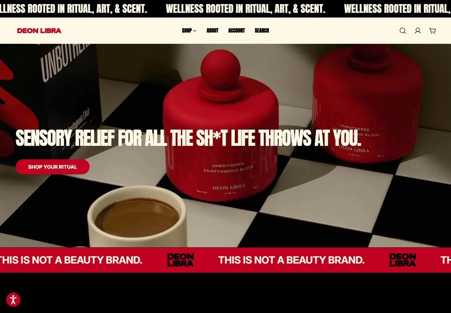
Live capture at 1440px, 2026-10-24
How it’s built
- Layout
- Cream header above a full-width red product scene; huge cream uppercase headline spans the image with alternation of thin high-contrast serif and bold condensed sans forms. Small condensed copy and outlined button overlay lower left.
- Type
- Oversized uppercase mixed high-contrast thin serif and heavy condensed sans; smaller condensed white copy.
- Color and surface
- Cream and deep red, tonal red objects and white accents.
- Components
- Cream header, red clustered objects, huge mixed-style headline, small lower-left copy and outlined action.
What makes it work
- Tonal red object cluster
- huge mixed serif and condensed sans headline
- cream header
On a new subjectFor a public ceramics exhibition, cluster red sculptural vessels beneath huge cream uppercase type alternating thin serif and bold condensed sans, with a cream header.
Measured
Fonts loadedInter, Anton
H140px / 400 / -1.6px
Body text16px
Page background#fff8e7
Text color#000000
Page height5,400px
Computed CSS at 1440px, 2026-10-24.
Live behavior
- Today
- Deon Libra uses a black scrolling-style slogan band above a warm cream navigation bar with a dark red wordmark and compact shop/account/search/cart controls. The hero uses close-up product photography, large condensed white copy and a red pill-shaped “Shop your ritual” action; a second red band repeats the brand message lower on the page. The desktop opening and standard phone capture are covered by a cream newsletter panel with an image on one side, “STAY IN THE LOOP” heading, short signup copy, red email field, black “LOCK IN” button, social icons and a circular close control. The tablet panel stacks its image above the form. The reduced-motion fresh-load phone shows the hero product image, red slogan band and product cards without the newsletter panel.
- Responsive
- At 1440×1000 the navigation is horizontal and the newsletter panel overlays the center of the hero. At 768×1024 the nav is compact and the overlay fills most of the content width, with the photo above the form. At 390×844 the ordinary phone screenshot shows the same overlay stacked vertically over the hero; the separately loaded reduced-motion phone screenshot shows the hero and product-card section without the overlay. These captures do not establish exact breakpoints or why the overlay differs.
- Scroll
- At actual scrollY 750 the screenshot shows the compact navigation, product category labels, large product-card imagery and the newsletter panel still overlaying the content. A single scrolled capture does not establish sticky positioning.


