
Gallery screenshot, saved 2026-10-24
How it’s built
- Layout
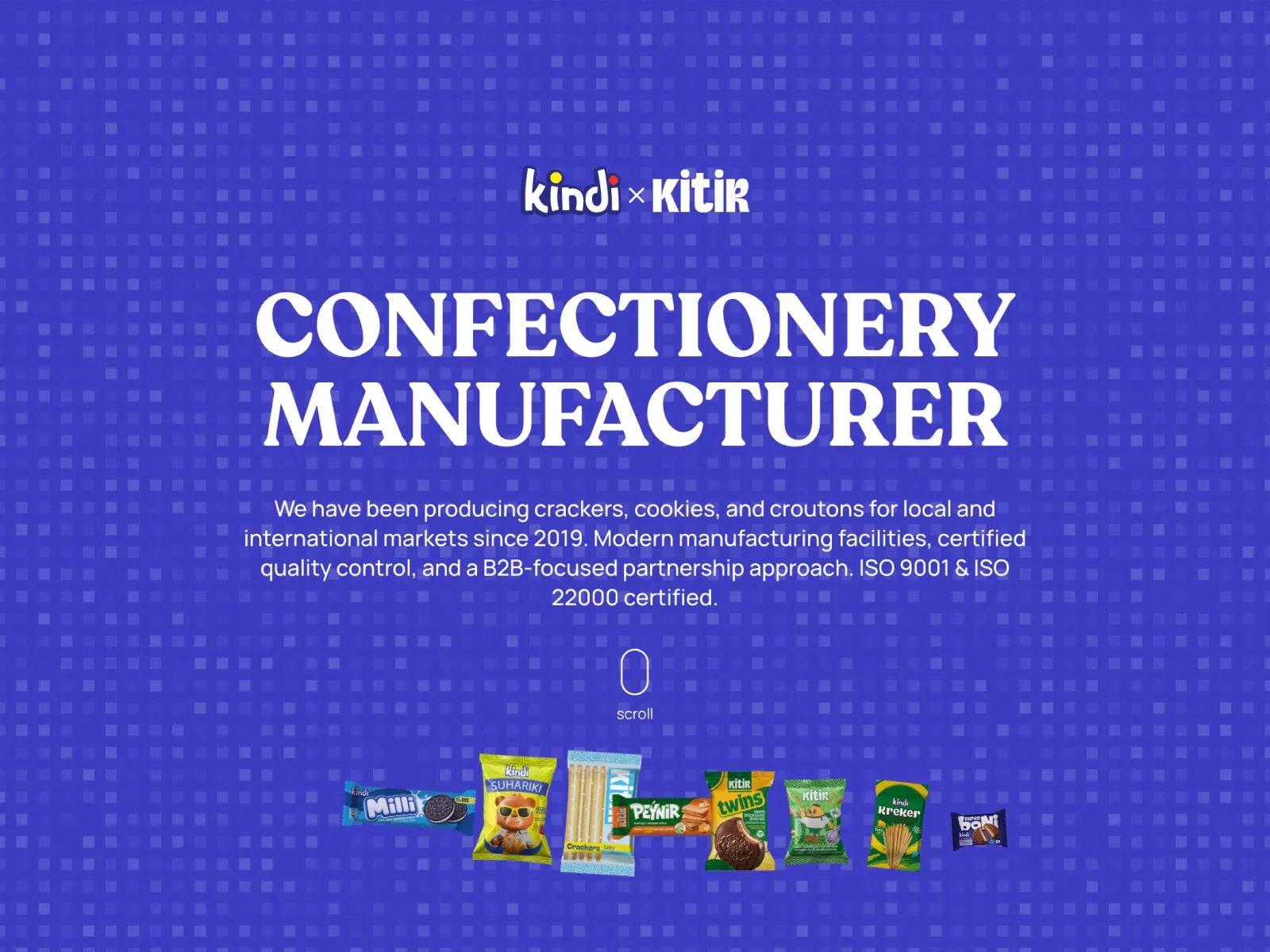
- A vivid indigo-violet page with faint repeating squares. A small centered Kindi × Kitir mark sits above huge white serif “CONFECTIONERY MANUFACTURER” type, centered sans copy, a scroll cue and a row of colorful packages at the bottom.
- Type
- Huge heavy high-contrast serif uppercase heading; centered sans paragraph and small playful rounded brand mark. Exact metrics unknown.
- Color and surface
- Saturated blue-violet, lighter square repeat, white type and colorful package accents.
- Components
- Centered identity, oversized role headline, explanatory copy, scroll cue and featured-product row.
What makes it work
- Saturated single-color field with restrained geometric texture
- Large centered high-contrast serif headline
- Compact centered supporting copy
- Supporting row of distinct featured items below
On a new subjectFor a public science-education publisher, use a vivid field with geometric repeat, a large centered serif learning-resources statement, concise copy and a lower row of teaching kits or book covers. Replace food manufacturing content while preserving centered hierarchy.
Live behavior
- Today
- The desktop hero centers a Kindi × Kitir mark, large two-line white serif headline and white sans-serif introduction on a saturated blue-violet field with a repeating translucent square pattern. A small Kindi mark and Menu + sit at the top corners; a nominee tab and WhatsApp icon occupy the right edge. At the sampled scrolled position, the remaining hero gives way to a white product area with tilted purple Crackers and Cookies panels and a large foreground cracker package.
- Responsive
- The same centered hero appears at 1440, 768 and 390 CSS px widths. The headline remains two lines but becomes smaller; computed H1 size/line-height is 96/96 px desktop, 60/60 tablet and 30/36 mobile. Supporting copy wraps into more lines. The nominee tab overlaps the right edge of the mobile copy in both saved mobile frames. The scroll cue appears in desktop hero frames but is not visible in the tablet or mobile frames; these views alone do not prove whether it is hidden or outside view.
- Scroll
- The desktop-scroll measurement records actual scrollY 750 CSS px. Its screenshot shows the lower hero and a portion of the product section; the logo and Menu remain near the same viewport corners in the two screenshots. Two stills do not establish the mechanism or full transition, and no product interaction was tested.


