
Gallery screenshot, saved 2026-10-24
How it’s built
- Layout
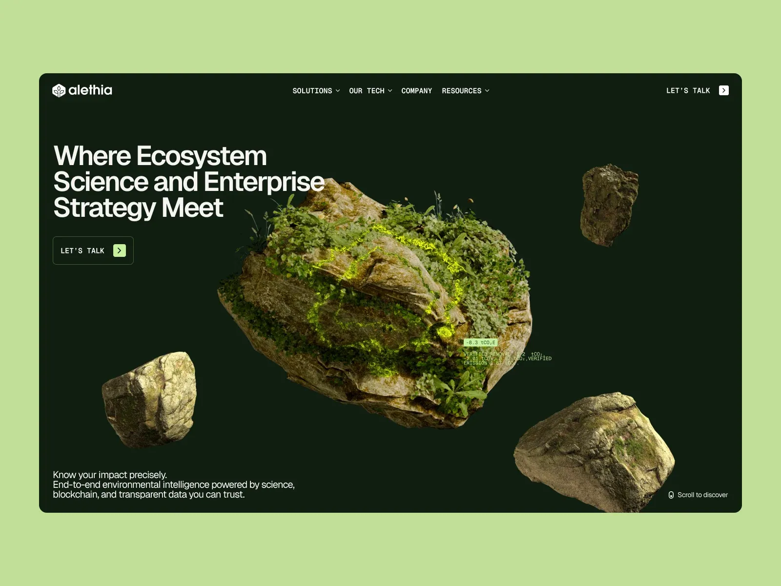
- A pale lime outer field surrounds an inset dark forest-green page with rounded corners. A compact top navigation and brand mark span the width. Large white multi-line statement sits upper left, while an oversized floating rock island with vegetation and a luminous yellow-green line occupies center. Smaller rocks float around it. A concise CTA sits below the headline; support copy anchors lower left and a small scroll cue lower right. Tiny numerical/measurement-style labels sit near the central rock. The outer pale-green field is treated as possible presentation framing.
- Type
- Heavy clean sans-serif headline, compact uppercase navigation, and small utility copy. Main copy is white on deep green. Tiny monospaced-looking figures overlay the center image. Exact type metrics are unknown.
- Color and surface
- Deep green page contrasts with white copy and fluorescent yellow-green line; moss, stone and foliage create a natural textured centerpiece. Pale lime outer field is outside the rounded panel and not assumed to be site CSS.
- Components
- Brand/nav row; large headline; outlined CTA with arrow; central floating ecological rock scene with numeric labels; concise support; scroll cue.
What makes it work
- Dark green bounded page
- Separate proposition and action
- Large dimensional environmental centerpiece
- Concise supporting copy
On a new subjectFor an unrelated city bike-share service, place a clear access proposition and real action beside a dimensional visualization of a transit map or station network on a dark page, then add concise service context. Keep the separate proposition/centerpiece relation while replacing the ecosystem subject, rocks and source data labels.
Live behavior
- Today
- Most saved Alethia frames are very dark loading-like captures: desktop t0 contains only a tiny white emblem on near-black, desktop t2 shows a dim floating rock, and desktop-scroll shows the rock brighter against a deep green-black field. Tablet and ordinary phone frames show a small white hexagon-like mark on near-black. Only the fresh reduced-motion phone frame exposes a dim page header (“alethia”), a “Where Ecosystem Science and Enterprise Strategy Meet” heading, a MENU control, a faint LET’S TALK action and several floating rocks.
- Responsive
- The desktop viewport is 1440×1000; its t0 document measures 1440×14192, while t2 and desktop-scroll measure 1440×1000. Tablet is 768×1024/document 768×15013, ordinary phone 390×844/document 390×13358, and the fresh reduced-motion phone 390×844/document 390×844. Saved images vary from near-black emblem/rock frames to a dim headline-and-rock scene. These states do not establish why loading or document dimensions differ.
- Scroll
- The desktop-scroll-labeled state records scrollY=0 in a 1440×1000 viewport with a 1440×1000 document. It shows a floating rock against a deep green-black background, rather than a confirmed lower-page position.


