
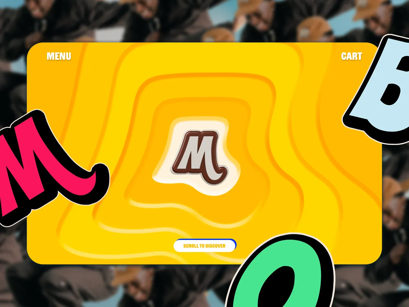
Gallery screenshot, saved 2026-10-24
How it’s built
- Layout
- Yellow-orange rounded panel floats above blurred photo. Nested irregular contours lead toward central emblem; menu/cart at upper corners and white pill action below. Huge sticker-like forms intrude from sides and green circle overlaps bottom. Clear central stage amid playful collage. Transfer central navigable stage plus expressive decoration. Stickers, monogram, photo and hues are specific. Cropping here is not a general rule; behavior unknown. The large central panel works as a stable stage amid irregular decorative shapes. Corner labels remain inside that stage and the bottom call to action is centered; the emblem and contour lines form a clear central target. The blurry photographic surround recedes behind a vivid opaque panel. Side stickers and lower circle are partially cropped, producing a playful sense of scale, but those exact forms are not necessary to the structure. Transfer the contrast between a calm central interaction area and expressive peripheral decoration, keeping controls away from visually noisy overlap. The visible panel looks rounded and layered; the screenshot cannot reveal whether those edges are implemented as UI surfaces, image artwork, or both. No menu or cart behavior, scrolling, responsiveness, or animation is evidenced. Typography can only be described visually, not tied to a named font or framework.
- Type
- Small white bold uppercase Menu/Cart labels sit at the top corners. Oversized sticker-like letterforms with thick black outlines and pale edging enter from the sides and bottom; a compact orange-on-white CTA sits centered low. The central brown/cream monogram is a separate focal mark. Font families and metrics are unknown.
- Color and surface
- Large rounded yellow-orange opaque panel with nested orange contour lines above a blurred photographic field. White CTA has a blue edge; peripheral stickers use pink, pale blue and mint with thick black/pale outlines. No precise colors or shadow measures sampled.
- Components
- Central emblem, top-corner menu/cart labels, central patterned panel, lower scroll CTA and oversized peripheral sticker artwork. The main panel is the interaction stage; stickers are decorative artwork rather than evidence of controls.
What makes it work
- Keep primary control and focal mark distinct from edge decoration
- Let surrounding image recede behind the central field
- Use scale and outline to make decorative forms readable without confusing them for controls
On a new subjectFor an interactive music archive, place the archive selector and key artist mark in a calm center panel, then surround it with a few oversized album-inspired graphics. Keep decorative shapes separate from controls and choose imagery and colors that identify the collection rather than this shopping brand.


