
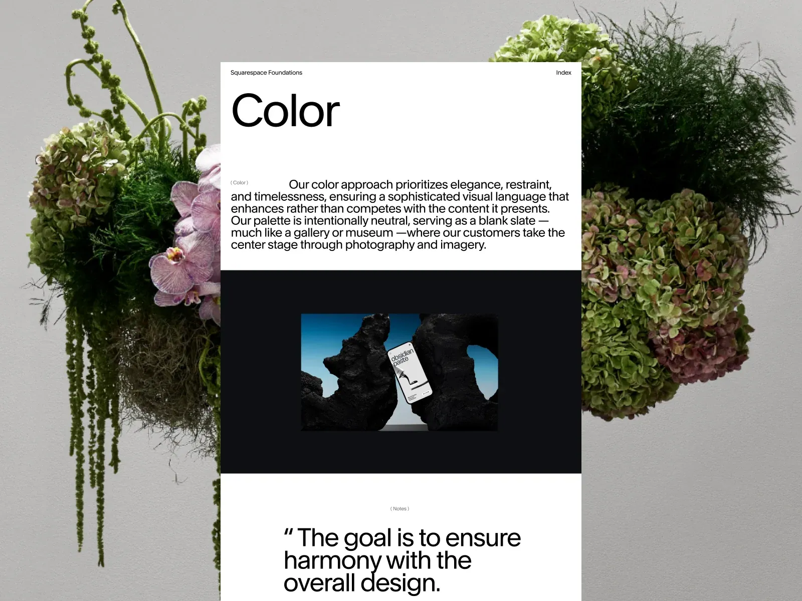
Screenshot from Awwwards, saved 2026-10-24
How it’s built
- Layout
- A long centered white page overlays edge-to-edge floral photography. Visible sequence is title and introduction, dark media block with small centered product image, then a white quote section cut by the bottom crop.
- Type
- The display lettering is visually dominant; smaller navigation, labels or supporting copy are secondary where legible. Exact typeface, rendered font identity and CSS metrics are unknown.
- Color and surface
- White editorial column and black media panel over green, mauve and cream floral photography; product image introduces blue/black tones. No sampled values.
- Components
- Narrow editorial page, title/intro, dark media panel with centered product image, quote section; flowers remain visible as side margins.
What makes it work
- Narrow central editorial column
- Photographic margins visible at both sides
- Alternating light text and dark media zones
- Distinct quote section in the vertical sequence
On a new subjectFor a city-history archive, place a narrow article over a streetscape photograph, alternate light text with a dark archival-film section, then end the visible sequence with a quotation.
Live behavior
- Today
- The opening desktop frame shows a black full-screen ground, small white identity and Index labels at the top, and several tilted floating panels surrounding a centered explanatory sentence. The next saved state changes to a warm dark-brown field with one centered portrait-format product photograph. The selected Awwwards gallery reference is a separate editorial composition with a white text panel, floral background and embedded product image.
- Responsive
- Tablet and normal phone frames show a single centered portrait-format product image on a warm brown ground, with identity and Index at top and section label plus arrows along the bottom. The photo scales larger relative to the tablet than the phone. The reduced-motion phone frame shows a dark loading screen with faint identity and spinner dots instead of the content, so it does not establish the intended reduced-motion layout.
- Scroll
- The desktop scroll-labeled capture reports scrollY 1 with a 1001px document in a 1000px viewport. The screenshot shows the product image and bottom section navigation; this near-zero scroll does not establish a long page scroll sequence.


