
Gallery screenshot, saved 2026-10-24
How it’s built
- Layout
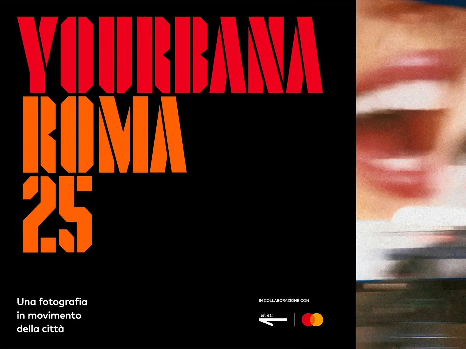
- Black left panel carries enormous angular red and orange stacked uppercase title, with small white support and partner marks below; a narrow blurred photographic-looking strip occupies right.
- Type
- Extremely tall angular stencil-like uppercase title, smaller rounded white sans support.
- Color and surface
- Black, vivid red and orange, white and warm blurred image.
- Components
- Stack angular red/orange title on black beside a narrow blurred image strip, with small white support below.
What makes it work
- Black field
- Huge angular red/orange stacked uppercase title
- Narrow blurred photographic-looking image strip
- Small white support
On a new subjectFor a public transport history exhibit, stack an angular red/orange uppercase title on black beside a narrow blurred vehicle image strip and small white support.
Live behavior
- Today
- Black field, oversized angular condensed red and orange display words, a small white sans caption and compact outlined upper-right controls. The desktop title dominates the left field while a thin vertical rail and small percentage occupy the right.
- Responsive
- Tablet and phone retain the oversized text but crop its right side and overlay upper controls. The observed cropping is a capture limitation, not a prescribed responsive rule. Desktop caption declares Mark Pro 28.57px and phone 24.1131px; PARTECIPA declares Flak 45.24px desktop and 38.1826px phone.
- Scroll
- Actual scrollY750 leaves a narrow red headline fragment at left against black, a right utility area and an 03% indicator. A vertical rail changes position. This single frame does not establish drag behavior.


