
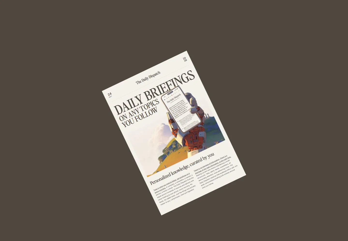
Live capture at 1440px, 2026-10-24
How it’s built
- Layout
- A large off-white newspaper-like poster sits centrally on beige with a tall serif title, date/masthead and an illustrated robotic hand holding a phone. A separate narrow right column has a serif access heading, orange action and low handwritten-looking note.
- Type
- Large high-contrast condensed-looking uppercase serif poster statement, smaller serif masthead, plain sans supporting labels and uneven handwritten-looking low note.
- Color and surface
- Warm beige ground, pale paper panel, charcoal type, saturated orange action and soft colorful illustrated landscape/robot artwork.
- Components
- Small corner avatar, large paper-like poster, date and dotted divider, illustrated device/hand, and detached right signup column.
What makes it work
- A large newspaper-like serif poster and illustrated device scene on beige, balanced by a separate narrow signup/note column.
On a new subjectFor a public geology digest, create a pale newspaper-like poster with tall serif strata headlines and an illustrated sampling instrument, beside a narrow orange signup action and handwritten curator note.
Measured
Fonts loadedPerfectly Nineties, Inter
H132px / 400
Body text16px
Page background#ece4d9
Text color#000000
Page height1,000px
Computed CSS at 1440px, 2026-10-24.
Live behavior
- Today
- The Daily Dispatch landing page is arranged like a broad newspaper front page on warm cream. A dated masthead sits above the large serif headline “DAILY BRIEFINGS ON ANY TOPICS YOU FOLLOW”; the main illustration shows a robot holding a phone over a bright landscape. A narrow right column invites visitors to scan a QR code and download the iOS app. A small handwritten note sits at far left. The selected gallery reference is a separate upright portrait image with the same Daily Briefings/robot composition. Its rail says “Request Testflight” and “Request early access. Limited beta seats,” with an orange Request Testflight button; the saved live capture instead shows a QR code and “Download for iOS.”
- Responsive
- Desktop measures 1440×1000 with a 5401px document; tablet 768×1024 with a 5513px document; ordinary phone 390×844 with a 5727px document. The desktop frames show the main illustrated front page and the download rail; the ordinary phone stacks the masthead, headline, artwork, explanatory copy and orange iOS download action. The tablet frame and fresh reduced-motion phone frame show the page content turned sideways within portrait screenshots, with large empty areas around it. These saved states do not establish why the orientation differs or define breakpoints.
- Scroll
- The desktop-scroll state records scrollY=750 in a 1440×1000 viewport and 5401px document. It shows “Personalized knowledge, curated by you,” explanatory copy and sample briefing cards under headings such as Industry updates and Brand mentions. This describes the captured position only.


