
Gallery screenshot, saved 2026-10-24
How it’s built
- Layout
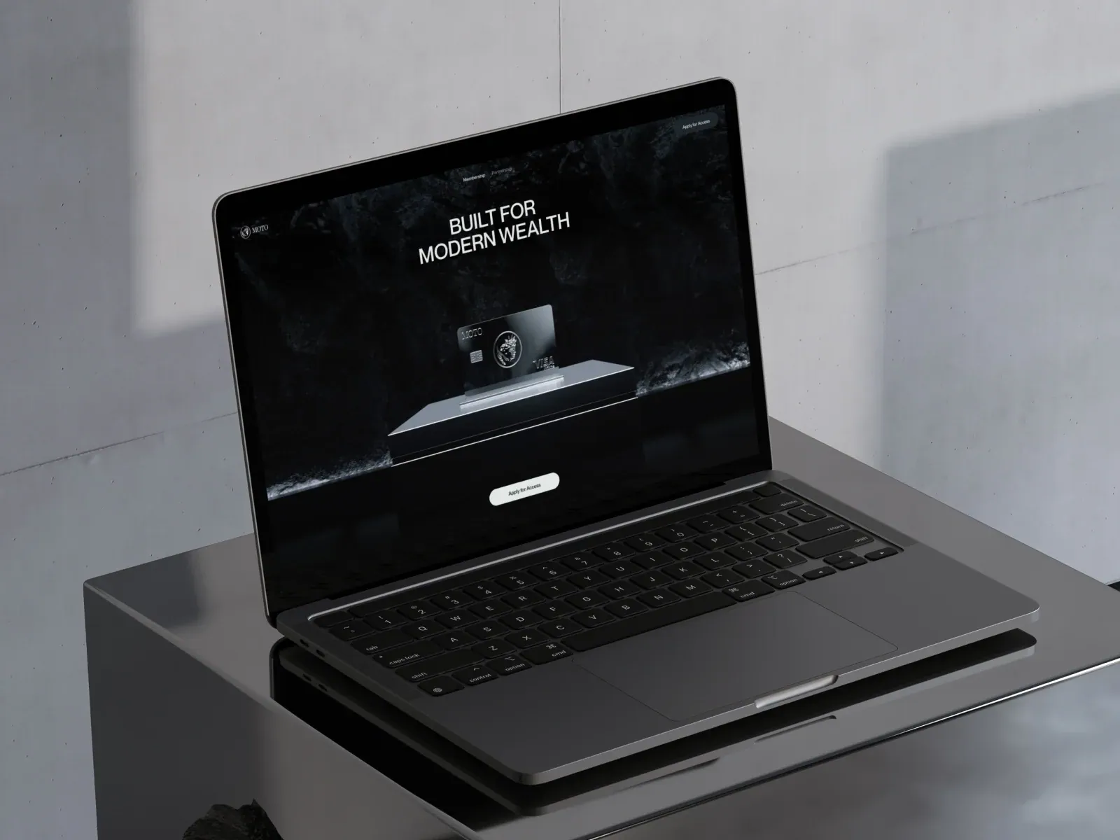
- Gallery image shows a dark laptop on a pale stone-like table. Within the tilted screen is a near-black page with small top navigation, a centered two-line “BUILT FOR MODERN WEALTH” claim and a small card object on a lit plinth. A pale application action sits below the page image. The laptop, table and outer room are presentation framing.
- Type
- In-screen page uses compact pale sans navigation and a medium-large uppercase sans claim. No exact face or metrics are available.
- Color and surface
- In-screen near-black textured field, white type, pale edge lighting and silver/black card display. The physical laptop and gray environment are outside the page.
- Components
- In-screen compact nav, centered claim, featured card object on a light stage and rounded application action; laptop/table are gallery framing.
What makes it work
- Dark in-screen field
- Concise central proposition
- One featured product/artifact display
- Clear action below
On a new subjectOn a dark page, center a short unrelated proposition above one representative artifact display, then place a clear action beneath. Replace finance-specific content and omit device framing.
Live behavior
- Today
- Moto Finance’s captured page uses a dark, cinematic black-and-charcoal environment with a textured stone backdrop and a sculptural silver MOTO Visa card on a pedestal. In desktop t0, the card is centered and the top navigation is faint; desktop t2 and hover-labeled frames show a bold centered “BUILT FOR MODERN WEALTH” headline, MOTO mark/navigation and a lower “Apply for Access” pill. The hover frame appears materially similar to t2, so the hover effect is not isolated. Tablet and phone retain the headline, card and apply control; smaller screens use a hamburger menu and place the card across the lower middle. The desktop-scroll frame at y=750 shows “INFRASTRUCTURE FOR HOW YOU MOVE,” short supporting copy and another Apply for Access button. Ordinary and reduced-motion phone captures are very similar, though the vertical Site of the Day badge differs. The selected gallery reference is a laptop mockup of the headline hero, not another live state.
- Responsive
- Desktop documents measure 1440×13048; tablet 768×13286; phone and fresh reduced-motion phone 390×11256. The hero headline, textured dark field, card pedestal and application prompt remain the primary composition. Tablet and phone replace the desktop membership/partnership navigation with a hamburger; on phone the card and pedestal span most of the width. These samples do not establish breakpoint thresholds.
- Scroll
- The desktop-scroll state measures actual scrollY=750 in a 1440×13048 document. The screenshot shows the next dark section with “INFRASTRUCTURE FOR HOW YOU MOVE,” supporting text describing a quieter way to move, and another Apply for Access pill. It does not test the application control or sticky behavior.


