
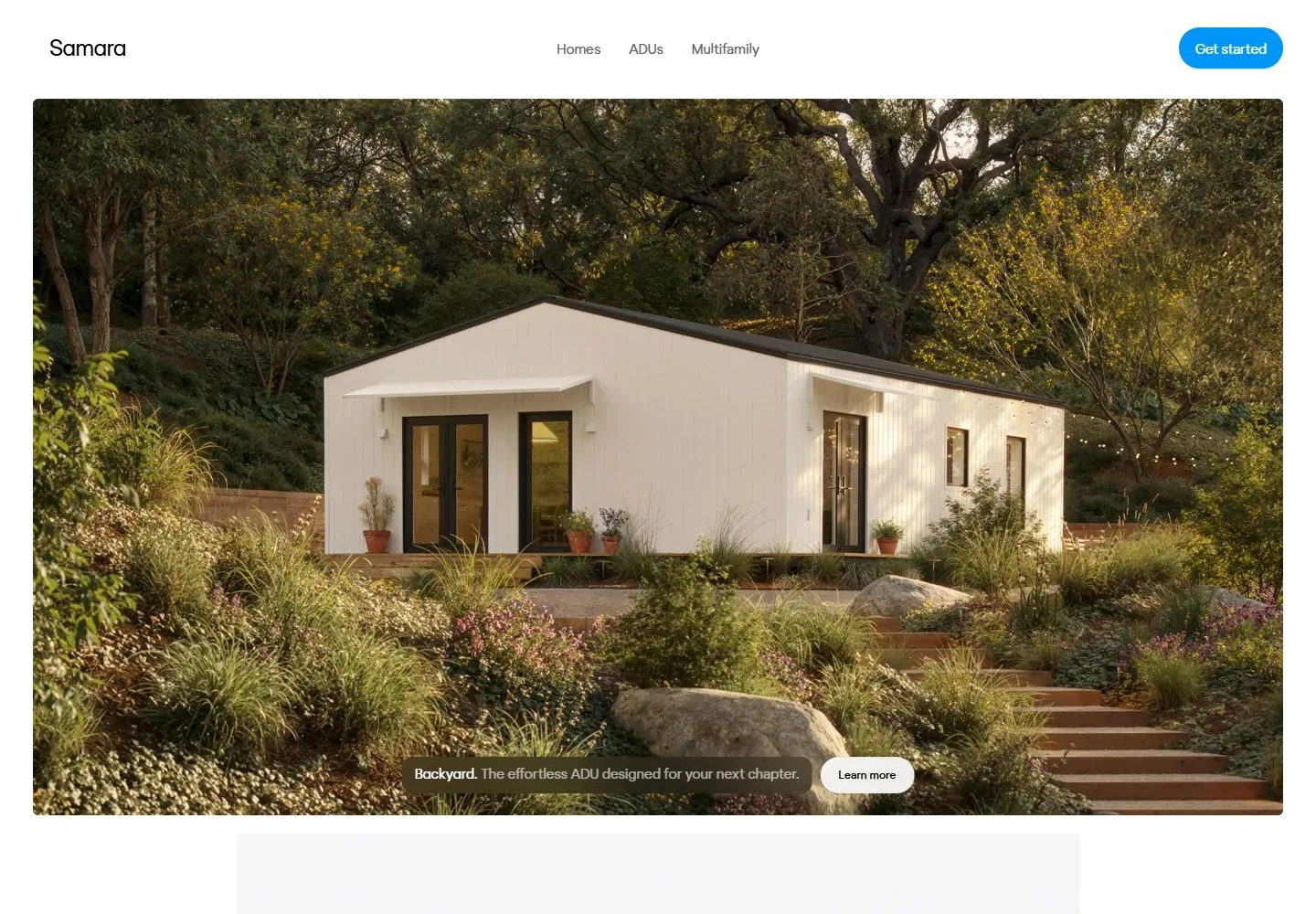
Live capture at 1440px, 2026-10-24
How it’s built
- Layout
- Dim dusk residential scene fills the view, with small white header, centered white title, bright blue top-right pill and lower down arrow.
- Type
- Light regular white sans title and smaller white navigation.
- Color and surface
- Dim warm dusk image, white text and bright blue pill.
- Components
- Full-field dusk image, centered title, top navigation and blue action.
What makes it work
- Dim dusk scene
- centered light white title
- small white navigation
- bright blue pill
On a new subjectFor a public night-sky observatory, use a dim dusk observatory scene with centered light white title, small top navigation and bright blue pill.
Measured
Fonts loadedregola-light, regola-book, regola-regular
H218px / 300 / -0.18px
Body text16px
Page background#ffffff
Text color#000000
Page height1,000px
Computed CSS at 1440px, 2026-10-24.
Live behavior
- Today
- The current Samara capture uses a white field, a small left wordmark, centered Homes/ADUs/Multifamily links, and a blue rounded Get started control. At desktop the main content is a large rounded architectural photograph with a low, centered translucent dark caption/action strip; the first timed frames show residential photography, while the state labeled desktop-scroll is actually at scrollY 0 and shows a multifamily scene. At tablet, the photograph is replaced in the first viewport by a spacious centered two-line statement with selected words in darker emphasis and the blue action at upper right. At phone width, a tall rounded home photograph fills most of the page below a compact header, with a lower dark caption and white Learn more pill. The ordinary phone capture shows Multifamily copy; the fresh reduced-motion phone capture shows Backyard copy. The independently saved gallery screenshot depicts a dark dusk scene and “Meet Backyard”; it is not used to characterize the current state.
- Responsive
- At 1440×1000 the DOM reports document height 1000 and scrollY 0 for desktop-t0, desktop-t2 and the state labeled desktop-scroll. Text samples use Regola Pro S: 15px navigation; the image-caption text is 15px with 19px line height, and Learn more is 12px with 15px line height. At 768×1024, a 48px centered statement with 52.8px line height occupies a 704px-wide box at x=32. At 390×844, the mobile hero image is measured 378×652 at x=6,y=96; text is 15px, and Learn more is 14px. Document height is 844 at tablet and phone. These captures do not determine breakpoints or why the content differs by state.
- Scroll
- Although one screenshot is labeled desktop-scroll, its exact measurement reports scrollY 0 and document height 1000. It shows a distinct multifamily hero scene, not a verified scrolled position. No sticky navigation or scrolling behavior is inferred.


