
Gallery screenshot, saved 2026-10-24
How it’s built
- Layout
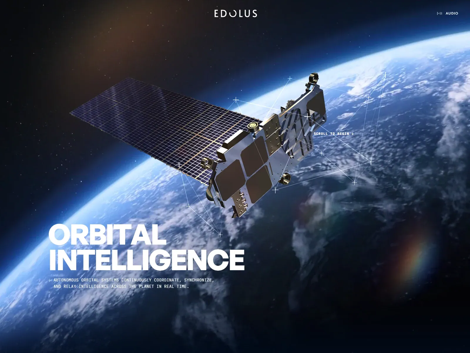
- Full-bleed space/Earth image centers a large satellite with fine geometric guide lines and cross marks around it. EDOLUS wordmark near top center and audio label upper right. Bold two-line white headline anchors lower left with compact uppercase explanation; “scroll to begin” cue sits beside satellite.
- Type
- Large heavy uppercase sans headline; tracked uppercase wordmark/audio label; compact monospaced-looking explanatory copy. Exact family/metrics unknown.
- Color and surface
- Deep navy/black space, bright blue Earth limb, gray satellite, white type/guides, dim warm glow upper left; no panels.
- Components
- Space subject image, satellite, geometric annotations, wordmark, audio label, lower-left proposition/support and scroll cue.
What makes it work
- Dominant full-bleed subject image
- Compact identity
- Large separated proposition
- Concise support or annotation
On a new subjectChoose a relevant focal image, add sparse annotations that clarify it, then place a concise proposition/support in a separate corner. Replace space imagery and claims.
Live behavior
- Today
- The selected Edolus gallery image shows a finished orbital-intelligence hero: a satellite above Earth, centered EDOLUS branding, large white “ORBITAL INTELLIGENCE” headline, a short monospaced description and a scroll cue. The saved current capture set mostly shows a loading sequence instead: desktop t0 has a centered EDOLUS wordmark and 62% progress on black, desktop t2 has 96%, the reduced-motion phone load has 84%, and the desktop-scroll capture is a black frame with a faint horizontal line crossing the wordmark. The tablet frame shows Earth and the EDOLUS wordmark; the ordinary phone frame shows Earth, a partially animated headline and description, a pale rectangular action and a headphones cue. These are distinct capture frames and do not show a stable full page across all sizes.
- Responsive
- The desktop states measure 1440×1000 with 1000px document height and scrollY=0; tablet is 768×1024 with matching document height; phone is 390×844 with matching document height. The desktop and reduced-motion phone captures are loading states, while the tablet and ordinary phone show Earth imagery and portions of the hero. Because the same stable page composition is not captured at each width, these observations do not establish the site’s responsive layout or breakpoints.
- Scroll
- The desktop-scroll file measures a 1440×1000 document and actual scrollY=0. It shows the EDOLUS wordmark over a dark frame with a thin horizontal line, not a scrolled content section. No scrolling mechanism or post-hero layout was observed.


