
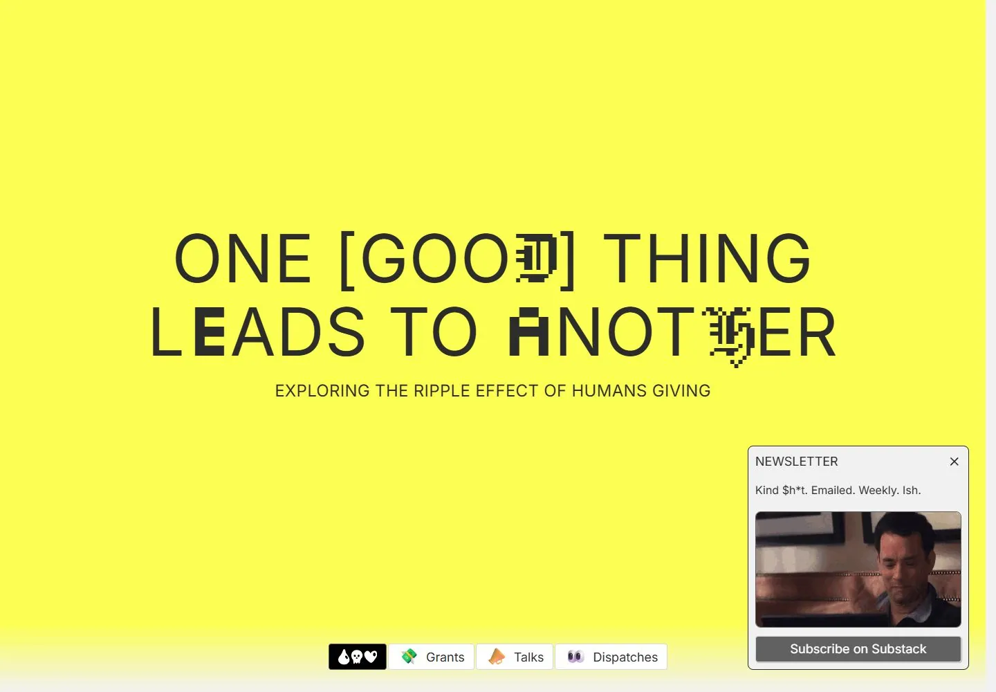
Live capture at 1440px, 2026-10-24
How it’s built
- Layout
- A centered two-line statement sits high in a fluorescent yellow field, with a smaller centered subtitle and a compact toolbar near the bottom. Several letters in the statement are replaced by pixel-like glyphs.
- Type
- Large regular uppercase sans with a few blocky substituted glyphs; small uppercase subtitle and modest toolbar text.
- Color and surface
- Fluorescent yellow, near-black type, a black leading toolbar tile and white/light-gray rectangular tabs; a pale fade appears along the bottom edge.
- Components
- Central statement, subtitle, bottom grouped icon/text tabs and a separate small envelope tile at the lower right.
What makes it work
- A bright yellow empty field, regular uppercase central statement with selected pixel glyphs and a compact bottom toolbar.
On a new subjectFor a civic seed exchange, use a large regular uppercase invitation with a few pixel sprout glyphs on yellow and compact bottom resource tabs.
Measured
Fonts loadedInter
H180px / 400 / 0.8px
Body text16px
Page background#f1f1f2
Text color#2c2c2c
Page height12,350px
Computed CSS at 1440px, 2026-10-24.
Live behavior
- Today
- Drop Dead Generous opens on a bright yellow field with a large black two-line headline, “ONE [GOOD] THING LEADS TO ANOTHER,” whose lettering includes pixel-like distortions, and the subtitle “EXPLORING THE RIPPLE EFFECT OF HUMANS GIVING.” A small icon/link row sits near the bottom of desktop, while a newsletter card overlays the lower-right corner. Tablet keeps the large headline and floating photos. Ordinary phone compresses the heading and floating image collage into the center, with a narrow white strip at the right edge of the saved frame. At y=750, desktop shows a light section with “DROP DEAD GENEROUS IS A GLOBAL EXPERIMENT IN GENEROSITY” and oversized grant/talk/dispatched text. The reduced-motion phone screenshot shows the title and subtitle on yellow but no surrounding collage images or newsletter card; a newsletter sign-up strip appears at the top.
- Responsive
- Desktop uses a 1440×1000 viewport with a 1425×12350 document; desktop-scroll records actual scrollY 750. Tablet is 768×1024 with a 753×12030 document. Ordinary and fresh reduced-motion phones are 390×844 with 375×9466 documents. The headline remains the main element in the saved widths, while floating imagery and navigation vary in the visible composition. These snapshots do not establish breakpoints.
- Scroll
- The desktop-scroll screenshot records actual scrollY 750 in a 1425×12350 document. It shows a pale section with the large statement “DROP DEAD GENEROUS IS A GLOBAL EXPERIMENT IN GENEROSITY” and oversized text about funding $500 grants, talks, and sharing learnings. The newsletter panel remains at lower right and the icon/link row overlays the lower content. This frame does not test an action or establish sticky behavior.


