
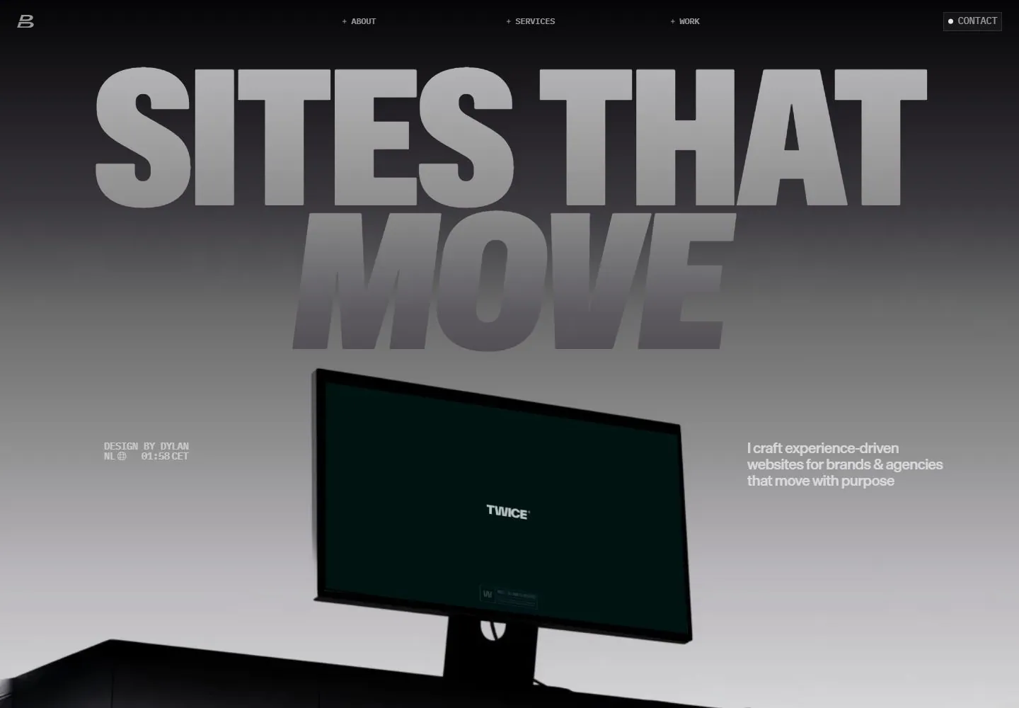
Live capture at 1440px, 2026-10-24
How it’s built
- Layout
- Inside a pictured monitor, a white page has a large centered black condensed uppercase title, small distributed metadata and navigation, and a wide image below. Outer giant presentation lettering and device may be staging.
- Type
- Large heavy condensed uppercase black sans, tiny compact metadata.
- Color and surface
- White field, black type and colorful photographic-looking lower image.
- Components
- A large centered condensed uppercase title sits over a distributed metadata row and wide image on white.
What makes it work
- White field
- Centered heavy condensed uppercase title
- Tiny distributed metadata and top navigation
- Wide photographic-looking image below
On a new subjectFor a public transit archive, place a centered heavy condensed uppercase title on white above tiny distributed metadata and a wide vehicle image.
Measured
Fonts loadedABC Gravity Variable, Die Grotesk B, IBM Plex Mono
H1273.75px / 400 / -5.475px
Body text12px
Page background#f1f1f1
Text color#3c3a3e
Page height8,605px
Computed CSS at 1440px, 2026-10-24.
Live behavior
- Today
- A near-black header sits above a charcoal-to-light-gray hero. The oversized uppercase “SITES THAT MOVE” title fills the upper half, with “MOVE” italic and darker; a tilted desktop monitor mockup anchors the lower center, flanked by compact designer credits and a short service statement. Tiny plus-prefixed navigation and a bordered Contact control run along the top. The displayed monitor artwork differs among saved frames.
- Responsive
- Tablet retains the huge two-line title, adds compact creator and role details beneath it, and places a wide monitor mockup below. Phone reduces the title, puts a B mark and Menu at the top, arranges the creator and role as two small blocks, and places the monitor above a Play showreel control. This is the observed capture layout; the phone fresh-load image instead starts with the monitor and exposes the next text section at the bottom. The ordinary phone measurement records a 517px document width at a 390px viewport; the screenshot alone does not establish the cause or horizontal-scroll usability.
- Scroll
- The desktop-scroll measurement records actual scrollY 750. The screenshot retains the large title and side copy while the monitor shows another website composition; a small Play showreel label is visible at the lower right. It is one sampled position and does not establish the full page flow or what the play control does. The monitor covers the lower portion of the word MOVE.


