
Live capture at 1440px, 2026-10-24
How it’s built
- Layout
- Black field with widely spaced white navigation along top and large centered image of dark books below; circular scattered-letter mark at upper left.
- Type
- Regular white uppercase navigation and small circular letter identity; image has giant pale numerals.
- Color and surface
- Black field with dark gray book image and pale text.
- Components
- Wide top navigation, circular identity and isolated centered object image.
What makes it work
- Black field
- widely spaced white navigation
- circular identity
- isolated dark artifact image
On a new subjectFor an archive of scientific instruments, isolate a dark instrument image on black beneath widely spaced white navigation and a circular letter identity.
Prompts
Create a visual direction for {{website_name}} in {{industry}} for {{audience}}, shaping {{content}} and supporting {{functionality}}.
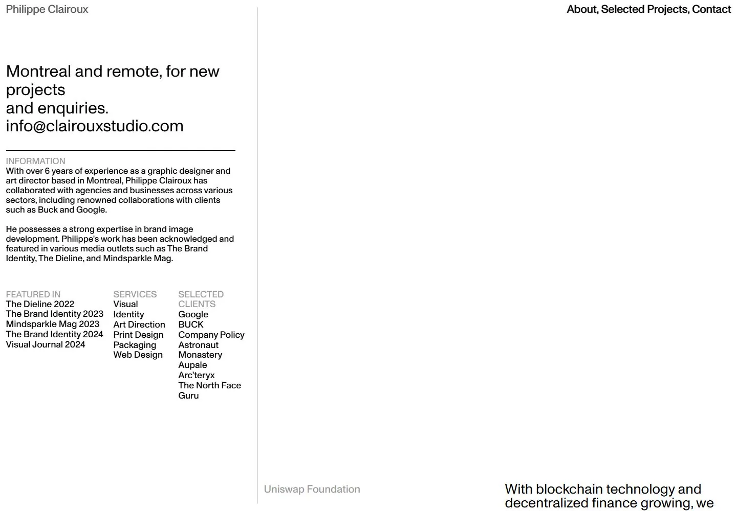
COMPOSITION INVARIANTS: Split the page into a narrow information rail and broad content field using one fine vertical rule. Put contact/introduction and factual lists in the rail; reserve the larger field for one project, feature, or statement. Preserve the observed visual hierarchy and spacing relationships, not the source-specific object inventory.
TYPE: Use simple sans throughout: larger contact lead, compact explanatory text, and quiet gray category labels. Avoid promotional display scale. Set a readable scale step between display text, supporting copy, captions, and utilities. Do not name a font family.
SURFACE AND COMPONENTS: Use white, dark text, pale secondary labels and a single fine divider; preserve the open character. Component roles: Top identity/nav, contact lead, short bio, grouped factual lists, divider and a broad project/content area. Keep controls visually distinct and subordinate to the main content.
IMAGE DIRECTION: Use a new relevant project or visual if available; do not prescribe a specific service, client, city, or sector. Proportion estimate from the selected still: Visual estimate: left rail about 35% viewport width, right 65% mostly open; header only a few percent height. Treat it as an estimate, not fixed CSS geometry.
VARIABLES: Adapt names, details, image subjects, palette accents, and working actions to {{website_name}}, {{industry}}, {{audience}}, {{content}}, and {{functionality}}.
PROHIBITIONS: Use original copy and assets. Do not reproduce the source brand, exact wording, photographs, illustrations, products, people, or signature artwork; source-specific objects and motifs are optional only when they genuinely fit the new subject.
CONTINUATION: Continue with a project or detail section using the same simple text hierarchy and thin division.
RESPONSIVE PROPOSAL: Stack the right-hand content after the information rail and make contact methods easy to tap; remove excess empty width. These are design proposals, not observed mobile behavior. The selected still does not establish source fonts, CSS, implementation technology, motion, or control behavior. Do not present any of those as observed. Implement requested {{functionality}} as working new behavior without implying source validation.
Implement a responsive page for {{website_name}} in {{industry}} for {{audience}}, presenting {{content}} and working {{functionality}}.
INVARIANTS: Split the page into a narrow information rail and broad content field using one fine vertical rule. Put contact/introduction and factual lists in the rail; reserve the larger field for one project, feature, or statement. Keep the same relative prominence and spacing without requiring the same source objects.
TYPE AND SURFACES: Use simple sans throughout: larger contact lead, compact explanatory text, and quiet gray category labels. Avoid promotional display scale. Use white, dark text, pale secondary labels and a single fine divider; preserve the open character. Maintain clear display/body/utility scale, readable line lengths, and sufficient contrast. Components: Top identity/nav, contact lead, short bio, grouped factual lists, divider and a broad project/content area.
IMAGERY AND SCALE: Use a new relevant project or visual if available; do not prescribe a specific service, client, city, or sector. Visual estimate only: Visual estimate: left rail about 35% viewport width, right 65% mostly open; header only a few percent height. Use flexible widths and content-led dimensions; do not copy this screenshot's coordinates as fixed values.
VARIABLES: Adapt names, details, image subjects, palette accents, and working actions to {{website_name}}, {{industry}}, {{audience}}, {{content}}, and {{functionality}}.
PROHIBITIONS: Use original copy and assets. Do not reproduce the source brand, exact wording, photographs, illustrations, products, people, or signature artwork; source-specific objects and motifs are optional only when they genuinely fit the new subject.
CONTINUATION: Continue with a project or detail section using the same simple text hierarchy and thin division.
RESPONSIVE PROPOSAL: Stack the right-hand content after the information rail and make contact methods easy to tap; remove excess empty width. Use semantic content, keyboard-operable controls, visible focus, meaningful alt text, and no clipped content. The selected still does not establish source fonts, CSS, implementation technology, motion, or control behavior. Do not present any of those as observed. Implement requested {{functionality}} as working new behavior without implying source validation.
Measured
Fonts loadedMonument Grotesk Variable
H227.36px / 400
Body text14.5px
Page background#ffffff
Text color#000000
Page height91,701px
Computed CSS at 1440px, 2026-10-24.


