
Gallery screenshot, saved 2026-10-24
How it’s built
- Layout
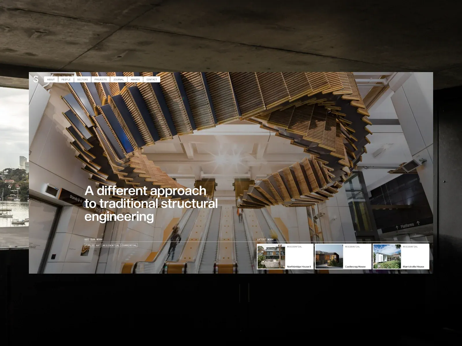
- A bounded page uses a full-frame architectural photograph of a dramatic timber installation over escalators. White multi-line copy sits lower left; tiny outlined category tags and a row of small white project cards run along the lower edge. Compact boxed navigation sits top left. Exterior room is gallery staging.
- Type
- Moderately large bold white sans statement, tiny mono-like labels and small card text. Exact painted font identity unknown.
- Color and surface
- Warm timber and neutral interior photograph, white type/cards and fine rules.
- Components
- Place bold white lower-left copy over a dramatic full-field architectural photograph, with tiny outlined categories and a row of small project cards along the bottom.
What makes it work
- Full-field architectural photo with sculptural overhead structure
- Bold white lower-left copy
- Tiny outlined categories and small bottom project cards
- Compact boxed navigation
On a new subjectFor a public train-safety program, use an original station photograph with a dramatic overhead structure, bold white lower-left message and a small bottom strip of safety-project cards.
Live behavior
- Today
- The live Structure Consulting Engineers page opens on a full-bleed architectural photograph of an escalator/stair interior. A large white sans-serif headline sits over the image, with a compact white S mark and pill-like navigation controls above; outlined category filters and latest-work cards appear below. The overall treatment uses high-contrast white controls over photography and broad pale sections.
- Responsive
- At desktop 1440×1000, the navigation and headline overlay the project photo; at scrollY 750, the hero and card row remain near the top while a pale section with explanatory copy enters below. Tablet (768×1024) and phone (390×844) use a compact black ticker/header, S mark, Menu/Projects controls, project photo, headline, filters, and latest-work cards. On phone the headline wraps across several lines and the card row is clipped at the right edge of the viewport. The reduced-motion phone screenshot shows a ghosted/transition-like multi-image hero composition in that single saved frame.
- Scroll
- A scroll capture at 750px shows the hero/card section and the beginning of explanatory copy lower in the viewport. Measurement document width is narrower than the 1440 CSS viewport on desktop (1425px), and on tablet/mobile the recorded document widths are 753/375 versus viewports 768/390. These are measured dimensions, not a diagnosis of cause.


