
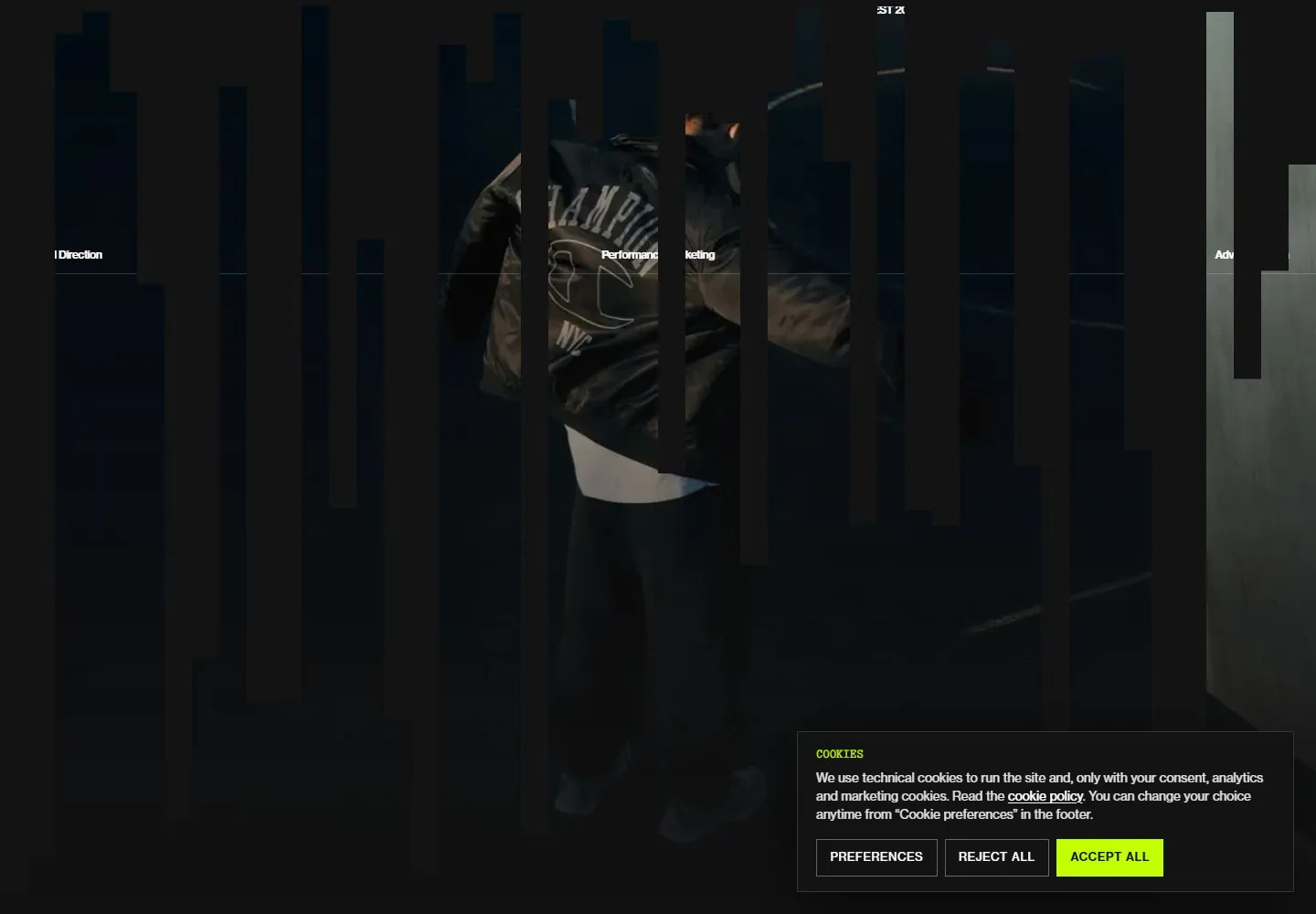
Live capture at 1440px, 2026-10-24
How it’s built
- Layout
- A bounded near-black page has a dark human photograph and subtle fine vertical grid. Huge white uppercase three-line statement dominates the center/lower region; tiny identity, description, contact and menu run across top, with service labels across a fine rule. Exterior grain photograph is staging.
- Type
- Huge heavy geometric uppercase sans with tight leading; tiny plain sans header and labels. Exact font and metrics unknown.
- Color and surface
- Near-black image, white text and faint vertical lines.
- Components
- Overlay a huge tightly stacked white uppercase statement on a near-black human photograph and fine vertical grid, with tiny distributed header and service labels.
What makes it work
- Near-black human photograph
- Huge tightly stacked white uppercase statement
- Fine vertical grid
- Tiny distributed header and ruled service labels
On a new subjectFor a public employment service, overlay a huge tightly stacked white uppercase invitation on a subdued original worker photograph with a fine vertical grid and tiny distributed utility labels.
Measured
Fonts loadedBull 5 Typewriter, neue-haas-grotesk-text
H242px / 500 / -1.68px
Body text14px
Page background#111111
Text color#333333
Page height9,134px
Computed CSS at 1440px, 2026-10-24.
Live behavior
- Today
- Dark full-bleed fashion-like imagery sits behind a fine full-screen vertical grid and a huge white three-line uppercase sans statement positioned low. Tiny tight white utility blocks, pixel-like identity artwork and a small white rectangular Menu control occupy the top. A thin horizontal line with three small service labels spans the upper third. Following content becomes near-black, retaining the grid and pairing typewriter-style project/platform rows with a centered tall project photograph and tightly set sans service descriptions. Consent is a separate black panel with an acid-green action at lower right.
- Responsive
- Desktop headline187.2px/149.76px with-7.488px tracking reduces to a visibly smaller three-line composition on tablet. Tablet document reports1440px width in768px viewport: retained horizontal overflow must not be ignored or treated as complete responsive success. Phone changes information architecture: tiny logo/language/Menu stay top, contact/location move to y242/y262, and a compact14px/15.4px description appears around y323. Declared54.6px/46.41px lower title is behind consent from y566, so phone display scale is not accepted as visibly demonstrated. Wide service labels and top descriptive block disappear from the phone image. Media IMG layers fill viewport bounds, but show different shots rather than a phase-matched crop comparison.
- Scroll
- Actual desktop scrollY750 leaves a clipped Agency line at the top behind persistent tiny header. A ruled case-study index begins near y290 with Partner/Platform/Service labels and a centered typewriter caption. First rows have12.74px/12.74px typewriter partner/platform text and small parenthesized indices, with tiny sans service descriptions right-aligned. A360px-wide tall project IMG begins near540,487 and extends below the viewport. A white selected row is partly visible at the bottom; no specific hover/selection trigger is established. Consent occludes lower right rows. The9034-plus-pixel page was not fully inspected; exact document height9134px is retained in measurements.


